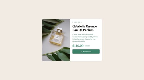
Used Tailwindcss and flexbox

Solution retrospective
Am most proud of completing the project according to the time estimation. Would like to focus more on the color scheme and recognizing the font-weights on different font styles.
What challenges did you encounter, and how did you overcome them?Had an issue with the layout of the page. Noticed that the image and content height were not correspondingly aligned with each other in respect to the responsiveness of the page so had to force the image and content height to be specific. Also had to change the object fit property of the image so that it was more easy on the eyes.
What specific areas of your project would you like help with?Would like help with best practices for images, and height and width of components with respect to the responsiveness of the page.
Please log in to post a comment
Log in with GitHubCommunity feedback
No feedback yet. Be the first to give feedback on Samir's solution.
Join our Discord community
Join thousands of Frontend Mentor community members taking the challenges, sharing resources, helping each other, and chatting about all things front-end!
Join our Discord