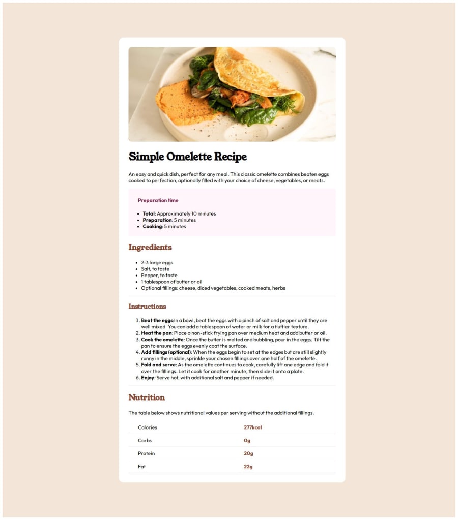
Used: Semantic HTML5 markup, CSS custom properties, media query, grid.
Design comparison
Community feedback
- @patriciarrsPosted 6 months ago
Greetings, Ajinkya! 👋
Good effort on this challenge! 👍 The layout looks good on a range of screen sizes 🙂
I want to suggest taking another look at using semantic HTML on your site as it will also improve accessibility. Currently, you are using
divtags to wrap other elements, but other tags (for example,mainandsection) are more suitable.If you’d like to learn more about using semantic HTML on your site, check out this course from web.dev.
Regarding the heading elements (
h1–h6), you can use multiple same-level elements (except forh1) as long as it makes sense. For example, instead ofh2,h3, andh4for the various section titles, they can all beh2.If you’d like to learn more about using the heading elements on your site, check out this article from MDN.
"Separation of concerns" is a good practice regarding HTML and CSS. Considering this, you could use HTML only for markup and have all the styles in the CSS file, instead of having inline styles in the HTML. This makes it easier to maintain and debug your page, as well as avoid CSS specificity-related issues.
The solution has some differences from the design. One of the most noticeable is the font color. In the given
style-guide.mdfile, there are various font colors used. Try out some of them to see what matches better (or if you have the Figma file, check there directly).I hope you find this helpful.
Happy coding!
0
Please log in to post a comment
Log in with GitHubJoin our Discord community
Join thousands of Frontend Mentor community members taking the challenges, sharing resources, helping each other, and chatting about all things front-end!
Join our Discord
