Submitted 11 months ago
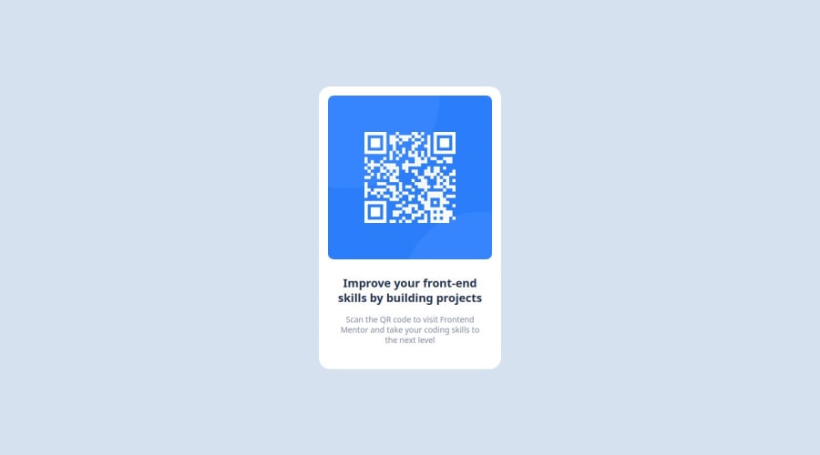
Used Semantic HTML5 and CSS (including Flexbox)
P
@Choconaldo
Design comparison
SolutionDesign
Solution retrospective
What are you most proud of, and what would you do differently next time?
Good use of Flexbox to center the card vertically.
What challenges did you encounter, and how did you overcome them?The exact size of the font and the line height.
What specific areas of your project would you like help with?Working with Figma.
Community feedback
Please log in to post a comment
Log in with GitHubJoin our Discord community
Join thousands of Frontend Mentor community members taking the challenges, sharing resources, helping each other, and chatting about all things front-end!
Join our Discord
