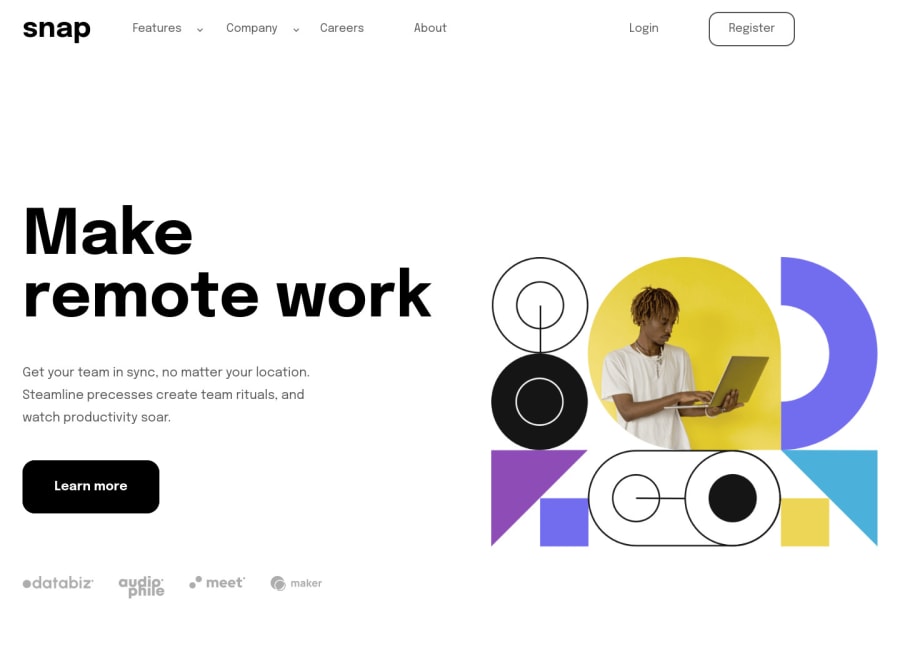
Used SASS (flexbox, grid, media queries) and plain JS
Design comparison
Solution retrospective
Had a lot of pain with the css, got it a bit spaguetti but I think is still undestable, this is my first project done by myself with no guideline and a lot of google/mdn/stackoverflow, did the resize at 900~ px because I think it looks better for a tablet to go the image first and then the text.
Hope of getting feedback of my JS (dropdowns and modals), and what can I improve on my SASS (a lot, I know)
Community feedback
- @mubizzyPosted over 2 years ago
Excellent job on this challenge!
Hope it helps:)...don't forget to mark it as helpful 👍
Marked as helpful0 - @James-aldersonPosted over 2 years ago
Hi David, the challenge you designed is very nice and well designed, there are just a few points that would help improve your design.
- Change the dropdown link to the dropdown button, in this case, when you click on it, it will no longer add the # sign to the url. best structure to create dropdown menu.
- Add a black shadow on the website content when clicking the menu button. Side Navigation.
- Use transitions instead of animation. Small changes from the challenge you designed:
HTML:
<div id="loading" class="modal__phone">
  ...
  <div class="modal__list">
    <a id="modal__phone--features" href="#">
      Features
      <img class="modal__list--img" src="build/img/icon-arrow-down.svg" alt="">
      <div class="modal__popup hiddenModal">...</div>
    </a>

    <a id="modal__phone--company" href="#">
      Company
      <img class="modal__list--img" id="phone__modal--arrow" src="build/img/icon-arrow-down.svg" alt="">
      <div class="modal__popup2 hiddenModal" id="modal-popup">...</div>
    </a>
    ...
  </div>
</div>
CSS:
.modal__phone {
  position: fixed;
  top: 0;
  right: 0;
  bottom: 0;
  width: 225px;
  transition: right 0.3s ease-in-out;
  background-color: #fff;
  box-shadow: 0 10rem 10rem rgba(0, 0, 0, 0.486);
}
.modal__phone.hidden {
  right: -255px;
}

.modal__phone--close {
  cursor: pointer;
  margin: 3.3rem 1.2rem 0 auto;
}

.modal__list {
  display: flex;
  padding-left: 3rem;
  gap: 2rem;
  margin-top: 5rem;
  align-items: flex-start;
  flex-direction: column;
}

.hidden {
  display: initial;
  overflow: initial;
}

.header__list.hidden,
.header__list2.hidden {
  display: none;
}

.hiddenModal {
  max-height: 0;
  overflow: hidden;
}

.modal__popup,
.modal__popup2 {
  overflow: hidden;
  transition: max-height 0.3s ease-out;
}
.modal__popup {
  max-height: 167px;
}
.modal__popup2 {
  max-height: 123px;
}

.modal__popup ul {
  display: flex;
  padding: 1rem 0;
  justify-content: center;
  flex-direction: column;
}
.modal__popup2 ul {
  display: flex;
  flex-direction: column;
  justify-content: center;
  padding: 1rem 0;
}

.hiddenModal {
 max-height: 0;
}
In this code, some changes have been written to display the notification menu better, you can see the changes by placing it in your project code. (in mobile resolution)
happy codding 🚀
Marked as helpful0
Please log in to post a comment
Log in with GitHubJoin our Discord community
Join thousands of Frontend Mentor community members taking the challenges, sharing resources, helping each other, and chatting about all things front-end!
Join our Discord
