

Design comparison

Solution retrospective
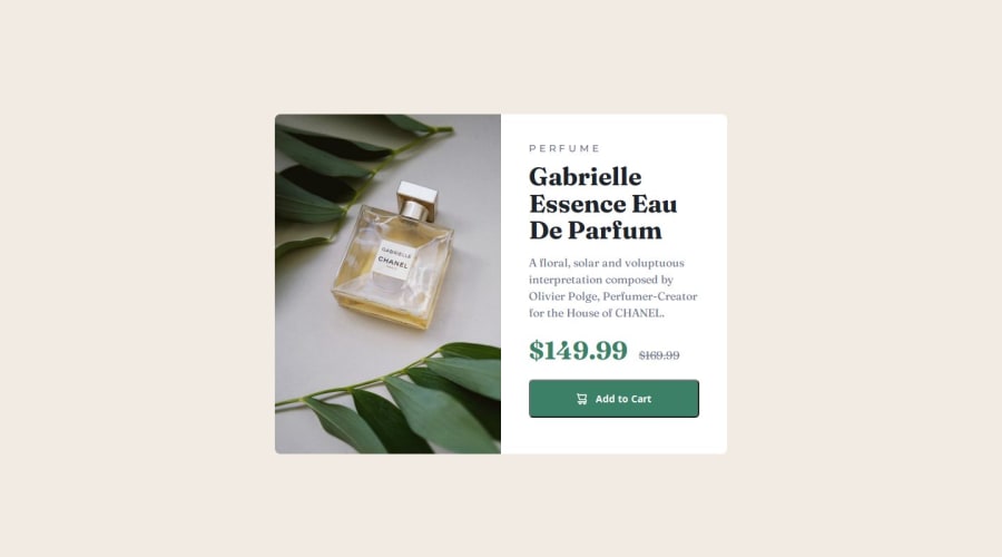
I am proud that I built this component just using plain HTML and CSS. I was doing backend from last 2 months and now came here did this Component just to feel little bit of confidence that I did not forget CSS completely. I would try to write more efficient code next time.
What challenges did you encounter, and how did you overcome them?Few CSS properties I knew but still searched on Google for them to make sure I am writing it right.
What specific areas of your project would you like help with?Padding and Spacing. Also the Strike through price needs to be little aligned above I guess looking at the design. I did not do that because I had less time to complete this.
Community feedback
- @nadam-designPosted 3 months ago
Hello @AAB007209!
You did a great job here, a few things to consider:
- Prices can align centered with flexbox: add the container (.pricing)
display: flex;andalign-items: center; - For the "add to cart" button: the
<button>element was a good choice. Addingborder: 0;or making it transparent ensures it matches the button design seen in the graphics. (You can add a :focus and :focus-within states too) - For
.cart-icon: using an<img>is a good solution, but if you have a vector icon, inline SVG is even better. It’s a resource-efficient option that saves one additional request.
Go on, keep up the good work!
Marked as helpful1 - Prices can align centered with flexbox: add the container (.pricing)

Please log in to post a comment
Log in with GitHubJoin our Discord community
Join thousands of Frontend Mentor community members taking the challenges, sharing resources, helping each other, and chatting about all things front-end!
Join our Discord