Used rem and em for relative consistency(I think its for relative con)


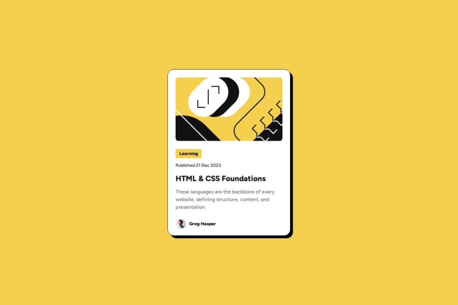
Design comparison

Solution retrospective
I am proud of using rem and em units for more consistency which I believe is better than pixels (please correct me if I am wrong). I would try to do this project a bit faster. Any general tips on time saves would be nice.
What challenges did you encounter, and how did you overcome them?On the author div section, I couldn't figure out why flex-direction row wasn't working and I realized that for display I had put flexbox instead of flex.
What specific areas of your project would you like help with?Tips on how to save time in general. Maybe how I can catch stupid errors faster. Also some tips on how I can improve my code would be nice :)
Community feedback
- @mod-prashantPosted 3 months ago
First of all, I want to commend you on the excellent work you've done with your project. As a beginner myself, I can clearly see the effort you’ve put into it.
Here are some suggestions to improve your code :
1. Semantic Elements
- Instead of using generic <div> tags for every section, try to use more semantic HTML elements like <article>, <section>, and <header>. This makes the code more readable and improves SEO.
2. Accessibility Improvements
- Add 'alt' attributes to the '<img>' tags to describe the images for screen readers.
3. Avoid Repeated ID Selectors for Styling
- Use class-based selectors for reusable styles instead of IDs (
#tag,#title, etc.), as IDs are specific and limit reusability. - IDs should be reserved for unique identifiers that are referenced by JavaScript or anchors.
4. Avoid redundant class
- Avoid redundant class names like 'class="inside-card"' for each child element of '#card-container'.
5. Simplify Complex Rules
- Simplify overly specific selectors and avoid redundancy. For example,
#content #title:hovercan simply be.title:hover.
6. Use Variables for Consistency
- Define common colors, font sizes, and spacings as CSS variables in
:root. This ensures consistency and makes future adjustments easier.
/* STYLE.CSS */

:root {
  --primary-color: hsl(47, 88%, 63%);
  --secondary-color: hsl(0, 0%, 7%);
  --light-gray: hsl(0, 0%, 42%);
  --white: hsl(0, 0%, 100%);
  --font-family: 'Figtree', sans-serif;
  --border-radius: 20px;
  --shadow-color: black;
  --font-small: 0.875em;
  --font-base: 16px;
  --font-large: 1.5em;
  --spacing: 1.5rem;
}
Marked as helpful0@JosephArifinPosted 3 months ago@mod-prashant Thank you for the feedback and great tips!
0 - @shadowbanksPosted 3 months ago
Hii @JosephArifin Great job completing the challenge 🥳
First off, I absolutely love how you used rem and em instead of px. I went through your code to learn a thing or two for myself, and I must say, I had a couple "ohhhh" moments :))
I do have just one little suggestion :)
- It's always a good idea to include a fallback font, you had:
font-family: Figtree;but I'd recommend something like this:font-family: "Figtree", sans-serif;
Unfortunately, I'm in the same boat as you I'd also love to figure out how to do these projects a bit faster. But I do believe with time, we'll both get faster as we become more familiar with the process. (edit: became your first follower on github :)) What do you think?
Marked as helpful0@JosephArifinPosted 3 months ago@shadowbanks Thanks for the feedback and I'm glad my code helped. Also thanks for the follow :)
0 - It's always a good idea to include a fallback font, you had:


Please log in to post a comment
Log in with GitHub
Join our Discord community
Join thousands of Frontend Mentor community members taking the challenges, sharing resources, helping each other, and chatting about all things front-end!
Join our Discord