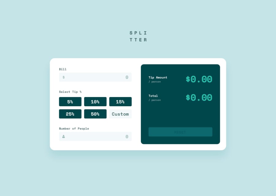
Used ReactJS, CSS-Custom-Props and mobile-first approach
Design comparison
Solution retrospective
Built with
- Semantic HTML5 markup
- CSS custom properties
- Flexbox
- Mobile-first workflow
- React - JS library
What I learned
I used this opportunity to practice my ReactJs knowledge and also CSS Custom-Properties. I managed to do all CSS responsiveness with only CSS Custom Properties and I really liked it. it felt amazing to only change a couple of things and Voila! now it works both in mobile mode and also desktop mode. To see how you can add code snippets, see below:
Continued development
I definitely would want to cut off some of my repeated code and also reach the goal with much fewer lines of code. Maybe I have to try using useRef, but that was not something I intended for this challenge.
Community feedback
- @mseidel819Posted over 2 years ago
nice! someone shared this with me, so I'll pass it to you. In order to get rid of the little scroll button on your number input, add this to your css: `/* Chrome, Safari, Edge, Opera */ input::-webkit-outer-spin-button, input::-webkit-inner-spin-button { -webkit-appearance: none; margin: 0; }
/* Firefox */ input[type="number"] { -moz-appearance: textfield; }`
Marked as helpful0@comendrunPosted over 2 years ago@mseidel819 Thank You, Matt. I appreciate your time and suggestion and I know the design doesn't have that scroll button, but for better accessibility, I think it would be better if it's up there. Wouldn't you prefer that if you're a mouse person instead of a keyboard person? :)) Anyway, thanks for the advice. I wish you the best of luck
1@mseidel819Posted over 2 years ago@comendrun absolutely! I changed the percent values on mine, because I thought they were more practical, too.
1
Please log in to post a comment
Log in with GitHubJoin our Discord community
Join thousands of Frontend Mentor community members taking the challenges, sharing resources, helping each other, and chatting about all things front-end!
Join our Discord
