Design comparison
Solution retrospective
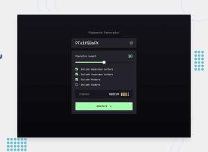
Had fun with this project. JS is getting a bit easier to work with. I am getting better at troubleshooting and researching for answers through google. The only problem was styling the checkboxes and slider bar. I could not figure out how to make them green. So, if you have any input I would greatly appreciate it!
Community feedback
- @ledminhPosted about 2 years ago
Making the checkboxes green is simple. I used the pseudo-class
::before, set the position toabsolutewith left and top equal 0, height and width equal 100%, then set itsbackground-colorto green. To make the check-symbol image displayed when checked, I used the pseudo-class::afterin the similar way but set itsbackgroundto be the check-symbol image when checked.Making the slider half-green-half-black is more difficult. After spending a day doing research on Stack Overflow, I figured the easiest solution is to use linear-gradient on background to make it 50% green and 50% black initially, then using javascript to change the percentage value when the input's value changes.
Marked as helpful2 - @ToFu96Posted about 2 years ago
What you can consider using is "accent-color". It doesn't really solve the problem when it comes to custom designs, but it is a quick hack to adjust the colors to the other content.
.your_css_selector {
    accent-color: hsl(127deg, 100%, 82%);
}
That looks good enough for this project.
Cheers!
PS: Your copy to clipboard doesn't work for me, so I guess you didn't implement it? Also, if you want an additional (JS) challenge, you can try to come up with your own "forumla"/algorithm to compute password safety. For that you probably should research a bit what makes a password secure. In my case, all my passwords with a length of 8 are considered insecure because they are easy to crack via brute force attacks. I increased my max. length of passwords to 30 and so I obviously consider all passwords of that lengths secure, even if the password only uses numbers. (I used
word-break: break-allto break it to the next line for long passwords.)If you want to go a step further you could even try to let the user decide which special characters they allow in the generation - I'm probably going to attempt that myself pretty soon. My idea is that a popup or something similar opens and the user can select which special characters they want to be used during password generation.
I also noticed that your algorithm always uses lowercase characters to create the password, even when not selected. That's something that should be changed. If no options are selected, I guess it's fine to assume lowercase characters as a default setting.
Marked as helpful1@waustin45Posted about 2 years ago@ToFu96 I appreciate the feedback and will go back and tweak it. I did implement the copy and paste feature, but I did so after posting it here because I forgot about it. I will make sure it got uploaded to github!
0 - @john-miragePosted about 2 years ago
Hello,
I have some articles about styling the range input.
You have two choices:
- Styling the range input itself.
- Styling Cross-Browser Compatible Range Inputs with CSS
- Building a Settings component (i recommend this one because of the progress bar trick for chrome)
- Creating a fake range input controlled by a real hidden range input.
- Customising Cross-Browser Range Inputs with CSS and JavaScript (i used this one for this project)
Creating a fake range input seems to be the best option overall because you have more control and it has a better browser consistency
Marked as helpful1 - Styling the range input itself.
Please log in to post a comment
Log in with GitHubJoin our Discord community
Join thousands of Frontend Mentor community members taking the challenges, sharing resources, helping each other, and chatting about all things front-end!
Join our Discord
