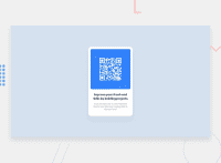
Used position absolute top, left 50% and translate it
Design comparison
Solution retrospective
Centering the project vertically
Community feedback
- @MelvinAguilarPosted about 2 years ago
Hi @trander123 👋, good job for completing this challenge and welcome to the Frontend Mentor Community! 🎉
Here are some suggestions to improve your code:
- Centering the element with position makes your element behave weird on mobile devices, with the "Inspect Element" option of your browser you can see your result on other devices, That's why you set
min-width: 250px;, to prevent thecardfrom getting thinner. There are two modern CSS techniques to center elements instead of position:
Using flexbox layout:
body {
   width: 100%;
   min-height: 100vh;
   display: flex;
   flex-direction: column;
   justify-content: center;
   align-items: center;
}
Using grid layout:
body {
   width: 100%;
   min-height: 100vh;
   display: grid;
   place-content: center;
}
And remove all the position properties from the container:
.card {
    padding: 1rem 0.75rem;
    /*min-width: 250px; */
    max-width: 320px;
    border-radius: 10px;
    background-color: hsl(0, 0%, 100%);
    /* position: absolute; */
    /* top: 50%; */
    /* left: 50%; */
    /* transform: translate(-50%, -50%); */
    margin: 0 auto;
}
More information:
- The Complete Guide to Centering in CSS
- A Complete Guide to Flexbox (CSS-Tricks)
- How TO - Center Elements Vertically (W3Schools) |
- CSS Layout - Horizontal & Vertical Align (W3Schools)
Tips:
- Try to fix the issues indicated by the report in this solution.
- Make the text of the attribute section a bit smaller
I hope those tips will help you.
Good Job and happy coding !
Marked as helpful1@trander123Posted about 2 years ago@MelvinAguilar Wow thanks a lot! I'm really struggling on implementing responsive layouts its like it looks good on desktop but when I inspect it to a mobile view its going shit HAHAHA. Thank you very much bro is there any way I can connect with you? Wanna ask for ideas to problems i will met in the future if you aint busy ^_^
0 - Centering the element with position makes your element behave weird on mobile devices, with the "Inspect Element" option of your browser you can see your result on other devices, That's why you set
- @correlucasPosted about 2 years ago
👾Hi Mico, congratulations on your solution!👋 Welcome to the Frontend Mentor Coding Community!
Great solution and a great start! From what I saw you’re on the right track. I’ve few suggestions for you that you can consider adding to your code:
- Use
<main>instead of a simple<div>this way you improve the semantics and accessibility showing which is the main block of content on this page. Remember that every page should have a<main>block and that<div>doesn't have any semantic meaning. - Replace the
<h3>containing the main title with<h1>note that this title is the main heading for this page and every page needs one h1 to show which is the most important heading. Use the sequence h1 h2 h3 h4 h5 to show the hierarchy of your titles in the level of importance, never jump a level. - Add a margin of around
margin: 20pxto avoid the card touching the screen edges while it scales down.
Here's my solution for this challenge if you wants to see how I build it: https://www.frontendmentor.io/solutions/qr-code-component-vanilla-cs-js-darklight-mode-nS2aOYYsJR
✌️ I hope this helps you and happy coding!
0 - Use
Please log in to post a comment
Log in with GitHubJoin our Discord community
Join thousands of Frontend Mentor community members taking the challenges, sharing resources, helping each other, and chatting about all things front-end!
Join our Discord

