Design comparison
SolutionDesign
Solution retrospective
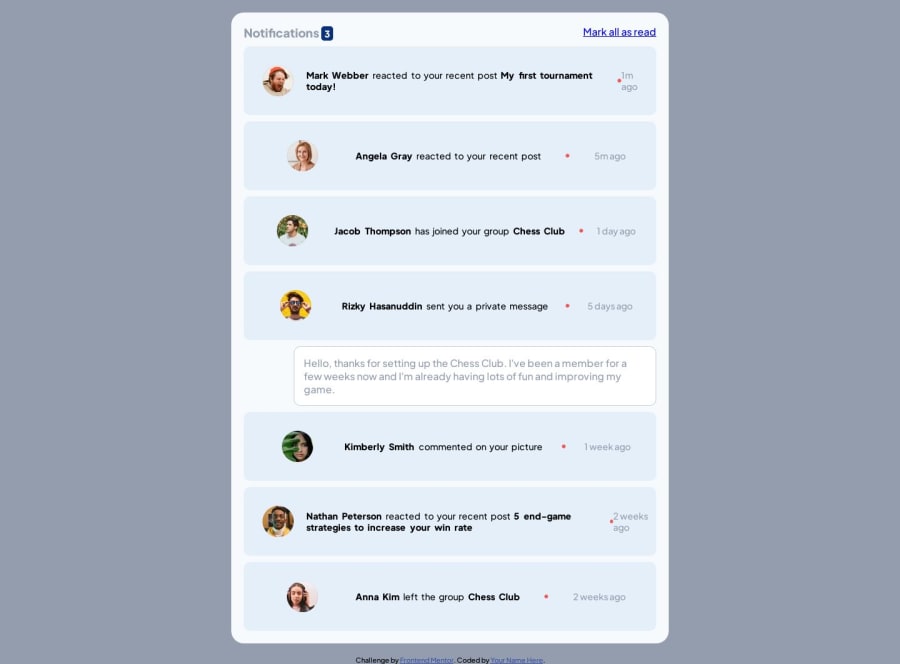
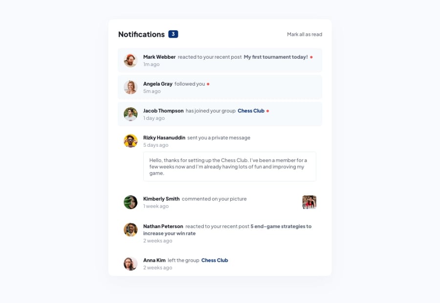
While it looks like it was easy to make but for the aligning part it was a little difficult to set one line to bold then next line to different color and then another design, I used flex to make them align right but I couldn't make the last line of posted time like (1min) to appear on next line as I cant remove flex and use it as normal paragraph line. And I trid to implement JavaScript to make the messages in read state which was ok but I think there has to be some easy ways for all of this to be done. All of your suggestions are welcome.
Community feedback
Please log in to post a comment
Log in with GitHubJoin our Discord community
Join thousands of Frontend Mentor community members taking the challenges, sharing resources, helping each other, and chatting about all things front-end!
Join our Discord
