


Hi there!
This looks good but there are some improvements I can offer you 🙂
First thing I notice with this is that 10% is quite a lot of padding! It makes the card very narrow on my smallish phone.
The next thing is that content is cut off on mobile landscape because you've got height 100vh. Change that to min-height and it will be fixed :)
Next, lose the width and height on the card (profile-bg). Instead let it be width 100% and max-width 350px (or similar). There is no need for height on it at all.
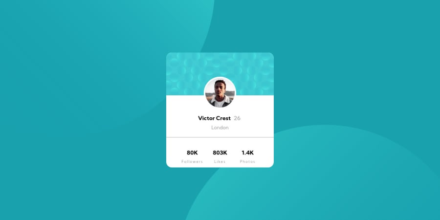
The profile picture is a meaningful one, so it should have alt text, not blank. The person's name is an ideal description of the image.
I don't know why you've got profile-footer center-div, then center-div again. That's double padding for no reason, and an extra div for no reason. Lose one of them.
I'm not sure why you've chosen your first heading level to start at h3? Is it because you are presuming this would be on a page with more content and a h1 and h2 already higher up? It's an odd choice to me... As this is a stand-alone challenge, I would start with h1, just like any other webpage.
The semantics in the stats isn't quite right. Those numbers don't make sense as h3s. They only make sense when accompanied by the word in their pair (80K followers). For that reason, you have to treat them like that in the elements you choose. So it would be valid to have these as 1 paragraph or list item per pair (with spans inside to control styles on the number and word respectively), a description list element, or a table (with the words as th and the numbers as td).
I recommend looking at how others have solved the background circle positions, see if you can work out how to make them sit in the right place at all screen sizes.
Last one - don't forget the shadow on that card.
That's all from me. I hope this is helpful.
