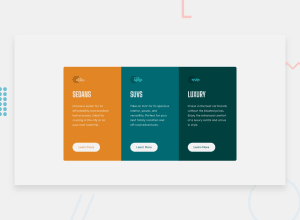
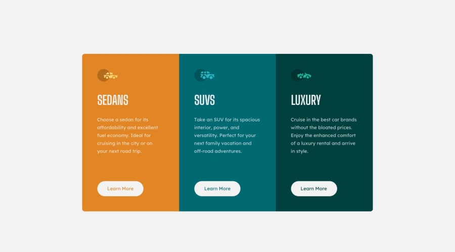
Design comparison
Solution retrospective
Just entering this field and this is the best that I could come up with. In need for the suggestion to help me improve this project and myself.
Community feedback
- @perezjprz19Posted almost 3 years ago
Hey there! Overall you did a good job, but I have a few pointers:
-
you can add aria-hidden = true to any images that you feel are not important enough to have alt text.
-
I would advise against styling on Id's and generally reserve them functionality.
-
on a bigger project, or one that you're gonna be updating, it might be helpful to come up with more descriptive names. Someone, including your future self, looking at #s, #su ,#l might be scratching their head for some time trying what those are tied to. Not so much a concern for this project because it is so tiny, but larger ones..... well. They might give you a headache.
-
it doesn't seem like you added any hover effects to it. You can do that very easily by background-color: transparent; to your buttons on hover and the color attribute to update the text.
-
Also, using margin: auto for the left and right side of your container is causing it to touch the edges of my screen on my phone. My want to update those to something else.
Marked as helpful1 -
- @NaveenGumastePosted almost 3 years ago
Hay ! Good Job you made it look nearly perfect to the preview
These below mentioned tricks will help you remove any Accessibility Issues
-> Add Main tag after body like it should be your container
-> For 1st heading or h1 tag, use header tag and then inside the header put your h1 or h2 etc
-> But use header tag only once in main heading element.
-> Reduce padding from left and right
Keep up the good work!
Marked as helpful1
Please log in to post a comment
Log in with GitHubJoin our Discord community
Join thousands of Frontend Mentor community members taking the challenges, sharing resources, helping each other, and chatting about all things front-end!
Join our Discord