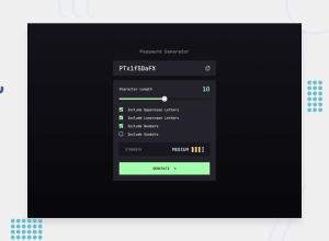
Design comparison
SolutionDesign
Community feedback
- @ChamuMutezvaPosted about 1 year ago
Hi alx29
Nice work on this challenge, well done. Here are some few observations:
- take note that the div with the class name
passwordBodyis overlapping its container. This is due to the following reasons: - the
Appcontainer has the height set toheight: 100vh;, that will limit the height to that value and in the case where the contents exceeds the height of the container , then the current scenario takes over. - usually you need to set the
bodyelement tomin-height: 100vh, that does the opposite of the point made above. That is , it will allow all the contents to stay inside the body container by allowing to scroll. Explicit heights on any of the children should be taken with caution and must be avoided if possible. Let the contents decide the height according to the given factors. - when the character length is set to zero and some of the conditions are set, a password is generated. Maybe the character length should not start at zero
- I have done the same challange and you can find my solution , Password generator
Marked as helpful0 - take note that the div with the class name
Please log in to post a comment
Log in with GitHubJoin our Discord community
Join thousands of Frontend Mentor community members taking the challenges, sharing resources, helping each other, and chatting about all things front-end!
Join our Discord
