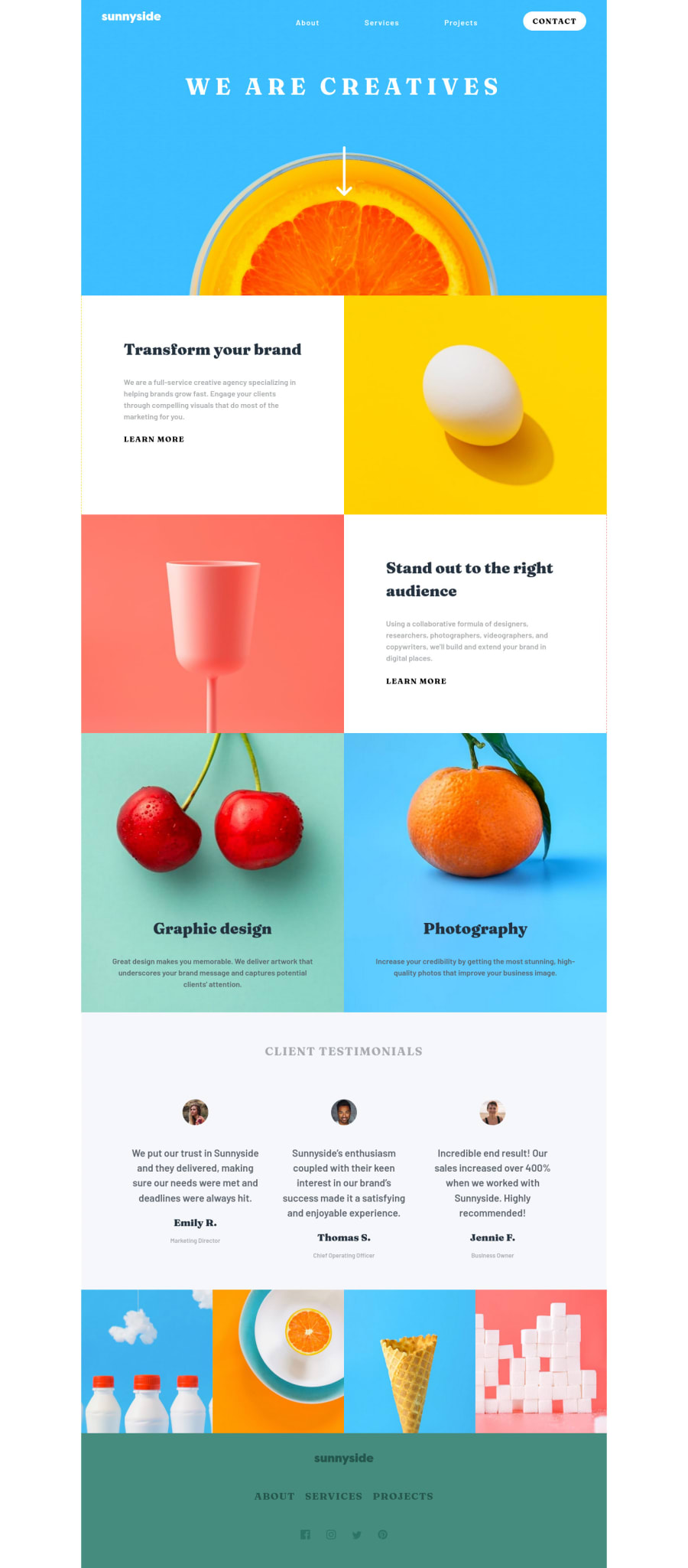
Design comparison
Solution retrospective
No specific questions about this one. All feedback is appreciated!
Community feedback
- @alex-kim-devPosted over 3 years ago
About that overflow / hamburger menu issue, right now you're applying
overflow-x: hidden;to every element using universal selector. This is kind of radical approach, some elements might still require the default overflow to be displayed properly. I think we should be more precise with that. The navigation menu hasposition: absolute, and the closest positioned ancestor element is.container- so the menu is positioned relative to the.container. Applyingoverflow-x: hiddento this element will fix both issues. (And don't forget to remove overflow from everything).Great job on this challenge 🎉
Marked as helpful1 - Account deleted
Hi,
The solution looks ok as far as the design goes, though I don't know why you set a
maximum width of 1100px... on my device I have white spaces on the sides and it's not even a very big screen.-
If you set the max-width because you don't want it stretching too much on big devices, I think you should go with the suggested 1440px.
-
The navigation bar gets messed up when you switch to desktop view while the mobile menu is still active. You should get that looked at, if for some weird reason the CSS doesn't take care of it, you can set up a media query in Javascript to automatically close the mobile menu when you switch to desktop view.
Marked as helpful0@RikvanderSarPosted over 3 years ago@thulanigamtee Just wanted to let you know that I fixed both issues. Thanks for your feedback!
0 -
Please log in to post a comment
Log in with GitHubJoin our Discord community
Join thousands of Frontend Mentor community members taking the challenges, sharing resources, helping each other, and chatting about all things front-end!
Join our Discord
