Design comparison
Solution retrospective
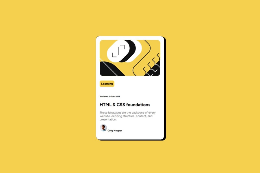
i'm most proud of how i figured out how to get the 'learning' to not spread across the whole row. next time, i'd try not to think as hard about how to center the div, because that messed me up a few times.
What challenges did you encounter, and how did you overcome them?centering the div, so i looked up how to center the div online. also, how to get the yellow 'learning' part to only be around the word and not the whole line, so i played around with it in vscode.
What specific areas of your project would you like help with?the avatar and text, and just overall constructive criticism.
Community feedback
- @dylan-dot-cPosted 4 months ago
Well done! This is a good solution but there are a few ways you can improve.
- make use of semantic HTML tags like main and article this can help screen readers and replace the divs you have
- I think you have overused the heading elements and they could be used better. I think there should be only one heading tag here and that would be the title,
HTML&CSS...and it can be an h2 as it doesn't need to be an h1. The rest of the tet could be paragraphs.
Also for the avatar, you could use flexbox to get it aligned vertically and look good. You might also need to put it into a separate container.
Also make use of css variables in your code especially for the colors
Overall you did a great job so take care and all the best
0
Please log in to post a comment
Log in with GitHubJoin our Discord community
Join thousands of Frontend Mentor community members taking the challenges, sharing resources, helping each other, and chatting about all things front-end!
Join our Discord
