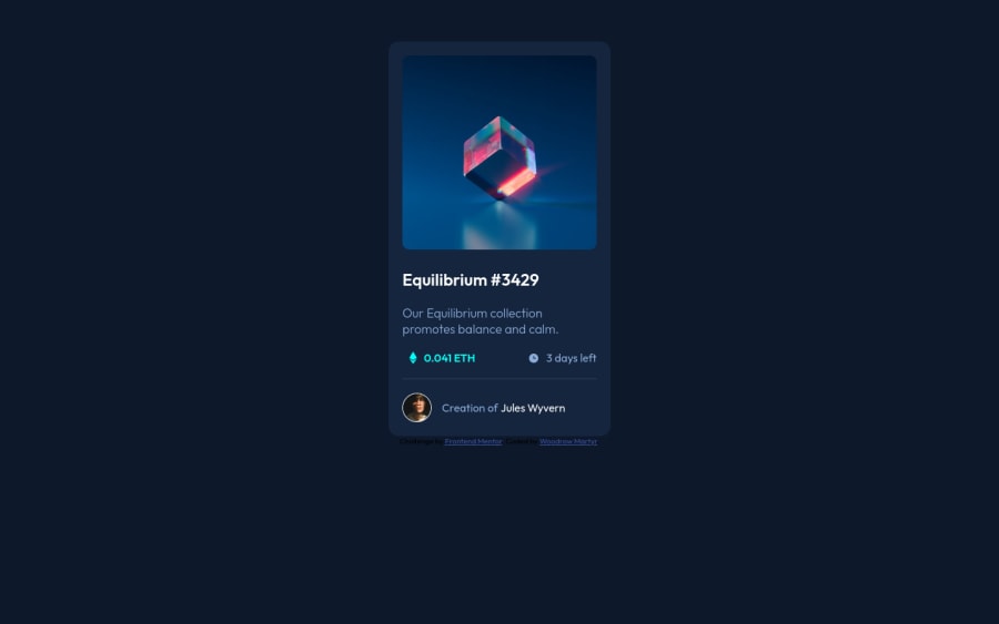
Design comparison
Solution retrospective
Hi everyone. I spent some time to get the hover effects right. I'm sure there's a better way to do the things better than what I've done here. Feedback is most welcome. Thanks.
Community feedback
- @SamadeenPosted almost 3 years ago
Hey Woodrow!! Cheers 🥂 on completing this challenge.. .
Lets firstly work on your accessibility issues.
Document should have on main landmarkbasically means your html should be structured more semantically and the correct format should be your<header>......</header>followed by your<main>......</main>and lastly your<footer>....</footer>hence you should use<main class="card">instead of<div class="card">.- Your
footershould be<footer class="attribution">instead of<div =attribution> Images must have alternate text- Its hard for screen readers to pick up messages from images withoutalttext.. Its always advisable to includealttext to aid screen reader
This should fix most of your accessibility issues.
- For your design here is a tip to center your container both vertically and horizontally
display: grid;place-content: center;min-height: 100vh;
. Regardless you did amazing... hope you find this helpful... Happy coding!!!
Marked as helpful0@wmartyrPosted almost 3 years ago@Samadeen Hi Abdul, Thank you for your tips. I would keep that in mind starting now. Cheers.
0
Please log in to post a comment
Log in with GitHubJoin our Discord community
Join thousands of Frontend Mentor community members taking the challenges, sharing resources, helping each other, and chatting about all things front-end!
Join our Discord
