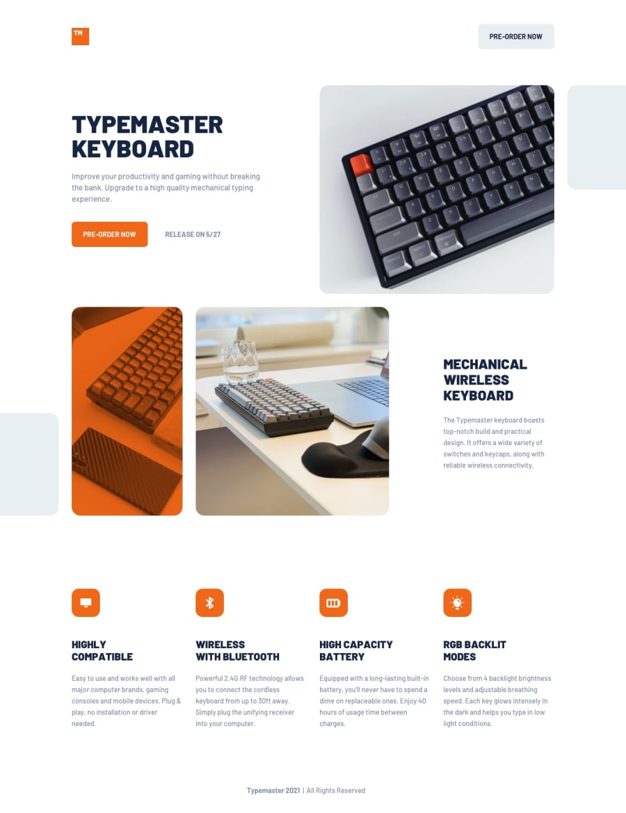
Design comparison
SolutionDesign
Solution retrospective
The chanllenge was particularly difficult - specially when it came to layout of the images.
Used transform: translateX(); with Flexbox and GRID in trying to control the layout of the images only.
Add some basic CSS transitions for the buttons.
Let me know how the site feels in terms of fluidity and responsiveness and if there's anything I overlooked.
Thanks in advance!
Community feedback
Please log in to post a comment
Log in with GitHubJoin our Discord community
Join thousands of Frontend Mentor community members taking the challenges, sharing resources, helping each other, and chatting about all things front-end!
Join our Discord
