Submitted over 2 years ago
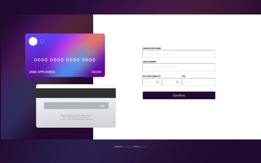
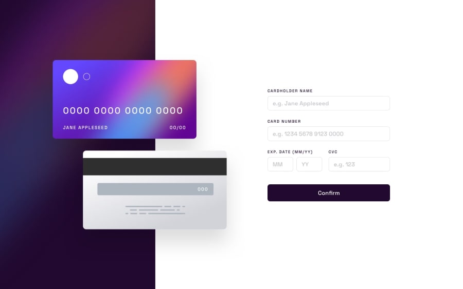
Used grid layout module for RWD. Create first mobile, later desktop.
@Darionas
Design comparison
SolutionDesign
Solution retrospective
It was hard to do it, but finally I have defeated it. Any feedback is appreciated. Thanks.
Please log in to post a comment
Log in with GitHubCommunity feedback
- @BilalSalmi
Hi Darionas, you did a good job! your design is good but still need to be optimized in terms of accessibility
-
- Accessibility recommadations*
- consider to use <h1> in your page
Read more about html heading here.
- consider using Html semantic elements like <section> <article> <header> <nav> <footer> in your page.
Read more about them here.
to improve your inputs's style consider to read this article.
keep it up!
Marked as helpful -
Join our Discord community
Join thousands of Frontend Mentor community members taking the challenges, sharing resources, helping each other, and chatting about all things front-end!
Join our Discord
