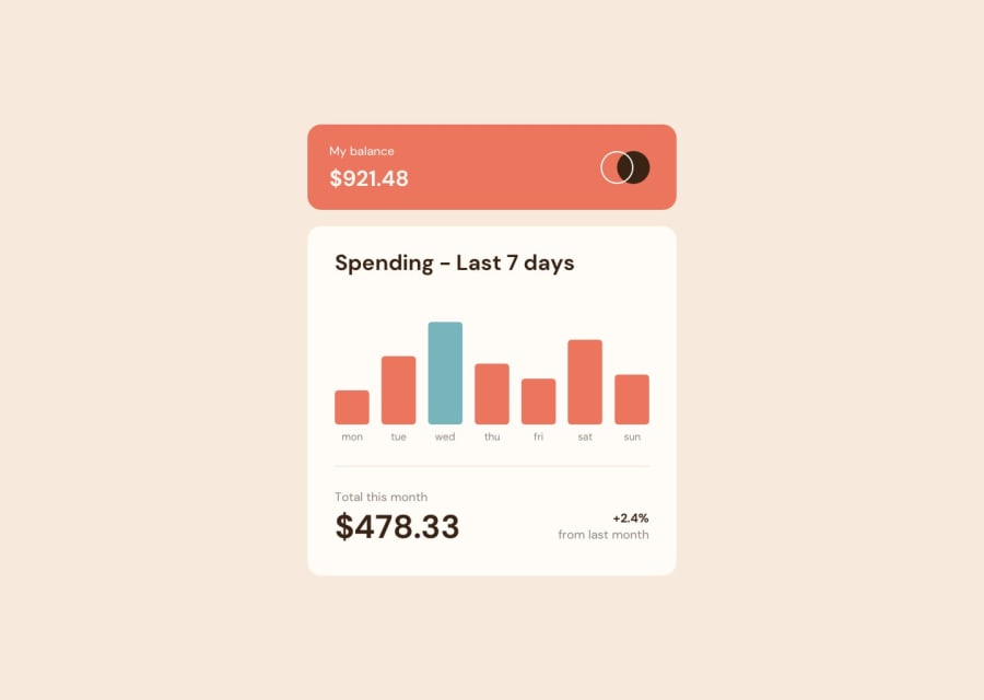
Design comparison
Solution retrospective
This was my first experience with fetch, considering that I don't even know what promises are. The disadvantage of this work is probably that I hammered the days of the week into the table with my hands, and not through json
Community feedback
- @visualdennissPosted over 1 year ago
Hello there,
congrats on completing the challenge successfully! On tablet view, it looks like the chart columns overflow the grid container, due to grid-template-columns: repeat(7, 50px); i'd suggest replacing it with grid-template-columns: repeat(7, 1fr); and adding some gap using gap: 5px etc. and also add some max-width to the grid container itself if necessary at all. This way the grid will be more consistent and flexible.
Hope you find this feedback helpful!
Marked as helpful1
Please log in to post a comment
Log in with GitHubJoin our Discord community
Join thousands of Frontend Mentor community members taking the challenges, sharing resources, helping each other, and chatting about all things front-end!
Join our Discord
