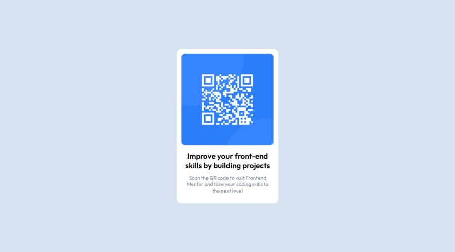


Design comparison
SolutionDesign

Solution retrospective
What are you most proud of, and what would you do differently next time?
I used flexbox after learning it.
What challenges did you encounter, and how did you overcome them?First of all I couldn't fit the image into the container, then I googled and learned about setting width: 100%. Then I struggled about setting the padding of the image. I tried setting the padding in the image, but I should have setting the padding in the container. After a while searching I found out the solution and solved it.
What specific areas of your project would you like help with?How do you determine the size of the element like, border-radius, padding, margin etc.
Community feedback
Please log in to post a comment
Log in with GitHubJoin our Discord community
Join thousands of Frontend Mentor community members taking the challenges, sharing resources, helping each other, and chatting about all things front-end!
Join our Discord