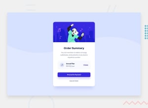
Design comparison
Solution retrospective
I realised lately that I have difficulty with my mark-up for some projects that I've been building... I need help on what to do.
I FINALLY COMPLETED THIS ONE AFTER SO MUCH MISTAKES...
NEED A REVIEW! 😍
Community feedback
- @FluffyKasPosted over 2 years ago
Heyo,
Please, please, when you submit your solution only use tags for tools that you actually used for creating your projects. This is really misleading to people who are looking for Angular/Bulma, etc projects..
Some thoughts about the project. Overall it seems pretty good but there are some things you may want to improve on:
-
You didn't add the background pattern to the desktop view. In the mobile view it's repeating. This you can solve with a
background-repeat: no-repeat. -
Your section has an unnecessary height of 50vh.
-
The "Order Summary" text should be a heading, not a paragraph.
-
For the music icon, you could leave the alt text empty, it's just a decorative image.
-
Your Proceed to Payment button is missing a hover state and a
cursor: pointer. -
The cancel payment button shouldn't be a paragraph, but a button or a link.
-
You're not using any font-family consistently. There's a font-family given in the style guide you should use. If you add it to the <body>, it will be applied to every element and you don't need to bother much with it (except for the buttons where you need to specify the font-family again).
Marked as helpful1 -
Please log in to post a comment
Log in with GitHubJoin our Discord community
Join thousands of Frontend Mentor community members taking the challenges, sharing resources, helping each other, and chatting about all things front-end!
Join our Discord
