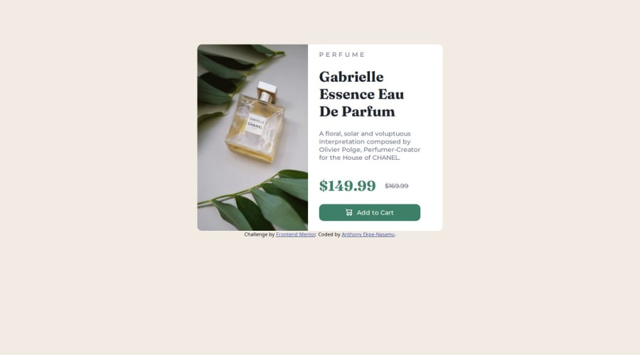


Design comparison

Solution retrospective
Understanding how to get the exact design when using media queries. And thought process for a solution. And live hosting using github
Community feedback
- @LanceOSPosted 8 months ago
Good work!
If you ever want to get the exact design of something there is a browser extension call "Pixel Perfect". It has become a must have for me as it makes working on these projects much easier since it takes out a lot of the guesswork on sizing.
Keep up the good work!
Marked as helpful0 - P@Carson-HaskellPosted 8 months ago
Hey, looks great! I would check the mobile layout though, using responsive design mode in your browser (or just resizing browser), because the mobile layout is all messed up! I wouldn't use a percentage for the width of your image, because it gets stretched/squeezed in a weird looking way as you resize the browser. Instead, think of the card as a flex container containing two items: img on one half, and content on the second half. In desktop, it's
flex-row, in mobile, it'sflex-col. So, the image should only take up 50% of the card, and the card should only get resized at a specific point. I think in this case, do avoid the weird stretching/shrinking, I would have two fixed widths for the cards (see Figma designs, if you have pro, otherwise just estimate), and then use a media query to switch between the widths/flex-direction.Marked as helpful0@TonyOgiePosted 8 months agoOkay, I think i understand what you're saying. I'll get on that now@Carson-Haskell
0


Please log in to post a comment
Log in with GitHub
Join our Discord community
Join thousands of Frontend Mentor community members taking the challenges, sharing resources, helping each other, and chatting about all things front-end!
Join our Discord