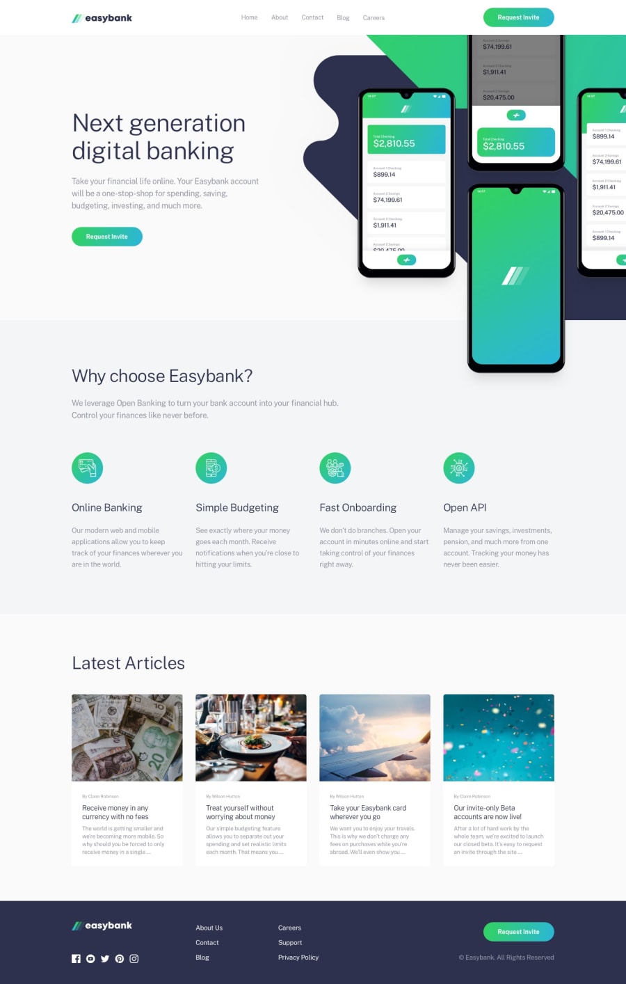
Design comparison
Solution retrospective
The part of the hero was quite complicated for me
Community feedback
- @Deevyn9Posted about 2 years ago
Hi Jair, congrats on completing this project, your solution is really great, on the mobile display, there are two issues that need handling.
Firstly the hero image doesn't appear fully and is looking compressed,
Secondly, the mobile nav-links are overflowing vertically and the top and the bottom links aren't appearing fully.
I hope you find this helpful.
Happy coding!
Marked as helpful0@JairthPosted about 2 years ago@Deevyn9 Hi! Thanks for you reply! ^-^ I don't have any of the errors you mentioned on my cell phone and some of my family members. Just in case, what device are you using?
0@Deevyn9Posted about 2 years ago@Jairth Hi, I used the chrome inspect tool on my pc
0
Please log in to post a comment
Log in with GitHubJoin our Discord community
Join thousands of Frontend Mentor community members taking the challenges, sharing resources, helping each other, and chatting about all things front-end!
Join our Discord
