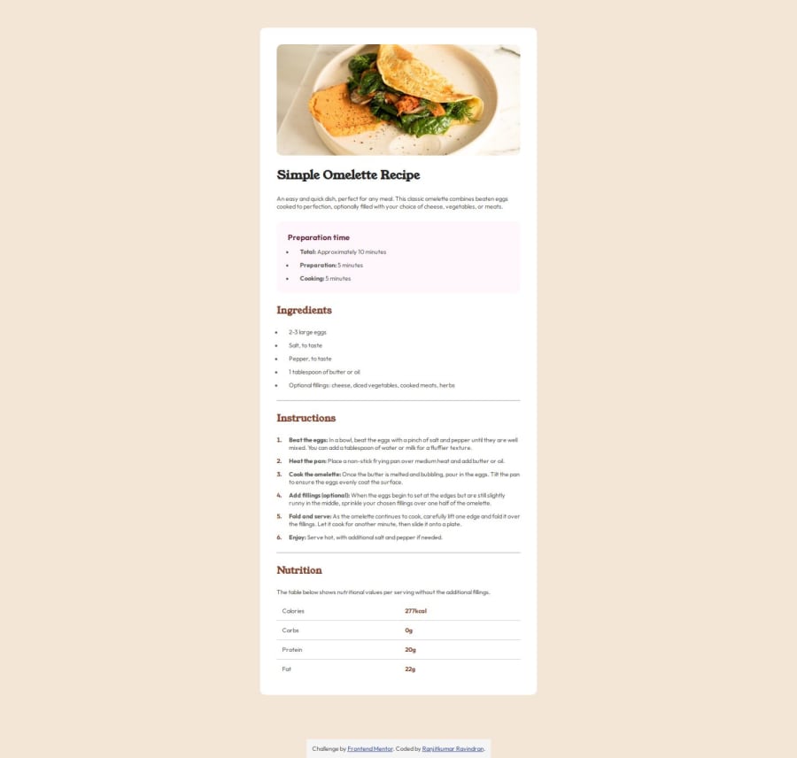
Used flex, media queries & semantic HTML for a responsive UI.


Design comparison

Solution retrospective
I’m proud of achieving a clean, responsive design that closely matches the reference. Next time, I’d optimize the CSS further by reducing redundant styles and improving accessibility with better ARIA attributes.
What challenges did you encounter, and how did you overcome them?The main challenge was ensuring responsiveness across all screen sizes while maintaining design accuracy. I overcame this by using a mobile-first approach, flexbox for layout control, and media queries for adjustments.
What specific areas of your project would you like help with?I’d appreciate feedback on how to further optimize my CSS and whether my approach to structuring the HTML is the most efficient. Also, any suggestions on improving the performance and accessibility of the page would be helpful!
Community feedback
- @4skinSkywalkerPosted 25 days ago
Looks fine. The spacing is a bit off here and there, the text is so damn small, I did this https://codepen.io/eternalsunshineofspotlessmind/full/xbxOXzL by eye and it looks more high fidelity.
0

Please log in to post a comment
Log in with GitHub
Join our Discord community
Join thousands of Frontend Mentor community members taking the challenges, sharing resources, helping each other, and chatting about all things front-end!
Join our Discord