Submitted over 4 years ago
Used flex, media queries, and relative units and also css variables.
@kishoreio
Design comparison
SolutionDesign
Solution retrospective
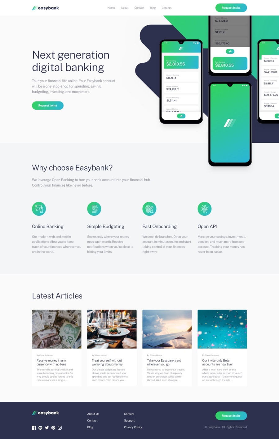
I did my best to create the easy bank landing and also there is an issue that my content is over flowing even though i used overflow: hidden it's not working. Please help me with an answer and also I would like to hear feedback on my code. Thank you
Community feedback
- @adarshcodesPosted over 4 years ago
Hi! @kishoreio, Good work on this challenge👍 to fix the overflowing problem make those two divs inside the section
width: 50%;andheight = 100%;to each and then try to addoverflow: hidden;to the main image container.- Design: your design looks fine, the problem you know already of overflowing image.
- Responsiveness: your responsive code is not working properly, and smaller devices the image you use for the article section becomes distorted(you can try
object-fit: cover;). - Issues aroused: try to fix the HTML and Accessibility issues after fixing your design and responsive code problem. Happy coding🙂
1@kishoreioPosted over 4 years ago@adarshcodes Thank you for feedback and yeah i will the issues.
0
Please log in to post a comment
Log in with GitHubJoin our Discord community
Join thousands of Frontend Mentor community members taking the challenges, sharing resources, helping each other, and chatting about all things front-end!
Join our Discord
