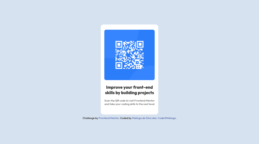
Design comparison
SolutionDesign
Community feedback
- @MelvinAguilarPosted about 2 years ago
Hi @CodeXMalinga 👋, good job for completing this challenge and welcome to the Frontend Mentor Community! 🎉
Here are some suggestions to improve your code:
- Use all flexbox properties and background-color on the body element, or remove
width: 1440pxfrom the.mainclass selector. - Try to use semantic tags in your code. More information here:
With semantic tags:
<body> <main class="main"> . . . </main> <body>- Add a
<h1>tag in your solution, The<h1>element is the main heading in a web page. There should only be one<h1>tag per page, and always avoid skipping heading levels; always start from<h1>, followed by<h2>and so on up to<h6>(<h1>,<h2>,...,<h6>). The HTML Section Heading elements (Reference)
Solution:
<h1>Improve your front-end skills by building projects</h1>I hope those tips will help you.
Good Job and happy coding !
Marked as helpful1 - Use all flexbox properties and background-color on the body element, or remove
Please log in to post a comment
Log in with GitHubJoin our Discord community
Join thousands of Frontend Mentor community members taking the challenges, sharing resources, helping each other, and chatting about all things front-end!
Join our Discord
