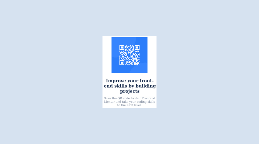
Design comparison
Solution retrospective
Do you think its a little bit okay?
Community feedback
- @MelvinAguilarPosted about 2 years ago
Hi @gift121 👋, good job on completing this challenge! 🎉
I have some suggestions you might consider to improve your code:
- You can use either the CSS @import rule to import the font-family Reference
In your CSS file add this line of code:
@import url("https://fonts.googleapis.com/css2?family=Outfit:wght@500;700;900&display=swap");And use it as follows:
.your-class-selector { font-family: "Outfit", sans-serif; }- Add an h1 tag to your solution. The
<h1>element is the main heading on a webpage, also, there should only be one<h1>tag per page.
<h1>Improve your front-end skills by building projects</h1>- Setting a defined
heightfor the card component is not recommended. The content should define the component height, otherwise, it will not be allowed to extend beyond your specifications. Alternatively, you can usemin-height.
.container {
    border-radius: 20px;
    /* height: 400px; */
    /* . . . Your style goes here */
}

.image img {
    /* width: 200px; */
    width: 100%;
    border-radius: 10px;
}

.text h1 {
    /* width: 300px; */
    color: hsl(218, 44%, 22%);
    margin: 2px;
    margin-top: 1em;
}

.text p {
    /* width: 300px; */
    color: hsl(220, 15%, 55%);
    text-align: center;
    margin-top: 1em;
}
I hope those tips will help you! 👍
Good job, and happy coding! 😁
1@gift121Posted almost 2 years ago@MelvinAguilar Thanks so much, will take all this into consideration
1 - @correlucasPosted about 2 years ago
👾Hi @gift121, congratulations on your solution!👋 Welcome to the Frontend Mentor Coding Community!
Great solution and a great start! From what I saw you’re on the right track. I’ve few suggestions for you that you can consider adding to your code:
- Reduce your code by removing unnecessary elements. The HTML structure is working but you can reduce at least 20% of your code by cleaning the unnecessary elements, you start cleaning it by removing some unnecessary
<div>. For this solution you wrap everything inside a single block of content using<div>or<main>(better option for accessibility) and put inside the whole content<img>/<h1>and<p>.
<body> <main> <img src="./images/image-qr-code.png" alt="QR Code Frontend Mentor" > <h1>Improve your front-end skills by building projects</h1> <p>Scan the QR code to visit Frontend Mentor and take your coding skills to the next level</p> </main> </body>- Replace the
<h2>containing the main title with<h1>note that this title is the main heading for this page and every page needs one h1 to show which is the most important heading. Use the sequence h1 h2 h3 h4 h5 to show the hierarchy of your titles in the level of importance, never jump a level. - Add a margin of around
margin: 20pxto avoid the card touching the screen edges while it scales down.
Here's my solution for this challenge if you wants to see how I build it: https://www.frontendmentor.io/solutions/qr-code-component-vanilla-cs-js-darklight-mode-nS2aOYYsJR
✌️ I hope this helps you and happy coding!
0 - Reduce your code by removing unnecessary elements. The HTML structure is working but you can reduce at least 20% of your code by cleaning the unnecessary elements, you start cleaning it by removing some unnecessary
Please log in to post a comment
Log in with GitHubJoin our Discord community
Join thousands of Frontend Mentor community members taking the challenges, sharing resources, helping each other, and chatting about all things front-end!
Join our Discord
