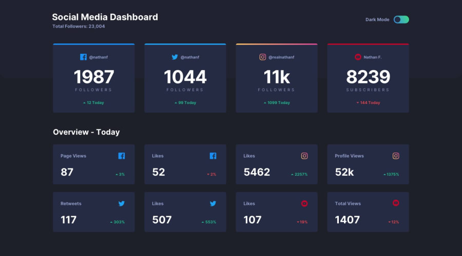
Design comparison
Solution retrospective
🎉 Check out my solution for the "Social Media Dashboard with Theme Switcher" challenge on Frontend Mentor!
🌗 Description: I implemented a theme switcher feature that allows users to toggle between light and dark modes. The design is responsive and supports different screen sizes. I utilized CSS variables and JavaScript to handle the theme switching functionality, and I made use of modern development tools like Gulp for build automation.
🙌 Feedback appreciated: I would love to hear your thoughts and feedback on my solution. Did I approach the challenge in an effective way? Are there any areas where I could improve or optimize the code? Feel free to leave your comments and suggestions.
👩🏻💻Thank you for checking out my solution!
Community feedback
- @peanutbutterjllyPosted over 1 year ago
hey @gisellecole 👋,
your solutions looks GREAT.
your code is spot on, VERY professionally written.
I like that the color scheme is stored in local-storage too so if I leave/come back it remembers which one I picked. (I tested it out and it does work 🙃).
no criticism from me, everything looks amazing.
Marked as helpful1@gisellecolePosted over 1 year agoHi Steve,
Thank you so much for your kind words and feedback! I'm glad you think my solution looks great. I wanted to let you know that I'm still in the process of learning and growing, so your positive feedback means a lot to me.
Thanks again for your support!
Best regards, Giselle
1
Please log in to post a comment
Log in with GitHubJoin our Discord community
Join thousands of Frontend Mentor community members taking the challenges, sharing resources, helping each other, and chatting about all things front-end!
Join our Discord
