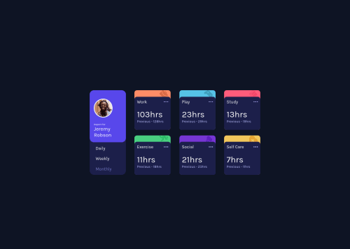
Design comparison
SolutionDesign
Solution retrospective
The building up of sections using document.createElement("div") is a good way or is there any other way to build this.?
Community feedback
- @GitHub-dev12345Posted almost 3 years ago
Congratulation to complete the challenge ❤️👍 My small suggestion : 1.In Card design CSS Code Used this:
transform : scale(0.8); this property decrease the size of card. 😉
large size for increase the number of scale & small size for decrease the number of scale
I hope you find this helpful
Marked as helpful0 - @RioCantrePosted almost 3 years ago
Hello there! Nice job in completing this project. Regarding your solution, I would like to recommend the following for you…
- Add media queries for the responsive design. With
max-width: 923px
as the starting breakpoint. From here use Flexbox for the alignment - Import the
attribution
style in CSS file and remove thestyle
tag - Instead of
div
, alternatively wrap the whole content with semantic tags, for HTML structures, refer it with this one Semantics. Wrap this line<div class="attribution">
withfooter
tag - Include description with the
alt
in image tags. Like this line<img src="images/image-jeremy.png" alt="">
Above all, the project is done well. Keep up the good work! Cheers!
Marked as helpful0 - Add media queries for the responsive design. With
Please log in to post a comment
Log in with GitHubJoin our Discord community
Join thousands of Frontend Mentor community members taking the challenges, sharing resources, helping each other, and chatting about all things front-end!
Join our Discord