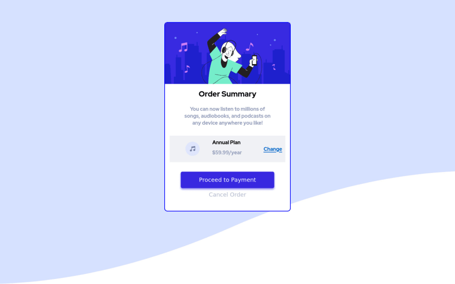
Design comparison
Solution retrospective
Any advice to improve is always appreciated.
Community feedback
- @uxcharPosted about 3 years ago
Looks great, some suggestions: scale up the size a little, play with the margins on your elements for more space, remove the solid border and add a box-shadow.
0@yhas14Posted about 3 years ago@uxchar I appreciate the feedback and also intend to update this project. How do you account for exact width and height of the container? It's hard to tell just by looking at it. Was thinking of dropping it into figma and trying to get measurements there. Let me know what you think.
0@uxcharPosted about 3 years ago@yhas14 Mostly trial and error without design files, or maybe as you suggested dropping into figma. Wouldn't worry to much about it, your solution is great as is. Just a few suggestions to get closer to the design if you wanted.
Marked as helpful0@yhas14Posted about 3 years ago@uxchar I appreciate that, I'll make those tweaks you suggested. I also looked at your code and was curious about something. For the background image that you applied to the main-container, how come when you use the background-color property it only affects the bottom portion of the image?
0@uxcharPosted about 3 years ago@yhas14 I think it just appears that way because the top is already a similar shade to the color applied, just a little darker. Add the pale blue background-color to your body and you'll see a similar result
0@yhas14Posted about 3 years ago@uxchar I just figured it out. It's the background-size property you applied. Technically only the top half of the image covers your container and the lower half is white, therefore the background-color property is applying to the lower half thats white by default. Learned something useful from you. Thanks Chauncey.
0@uxcharPosted about 3 years ago@yhas14 that''s great you figured it out. I do remember being stuck on this issue when I did this project. But yeah you're correct, it does apply to the lower half with background-size: contain on the image. Happy I could help👍.
0
Please log in to post a comment
Log in with GitHubJoin our Discord community
Join thousands of Frontend Mentor community members taking the challenges, sharing resources, helping each other, and chatting about all things front-end!
Join our Discord
