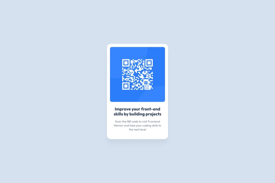
Design comparison
Community feedback
- @TanDevvPosted over 1 year ago
Hi, Victor20231! Good effort on this one! Let's talk about a few things in the accessibility report. :)
PS: There seems to be a broken link to your github code, this may be difficult for others to give you feedback as they don't have easy access to your repository.
📝HTML:
- Document should have one main landmark | All page content should be contained by landmarks
After your body tag, consider adding landmarks such as,
<nav>,<main>and<footer>as a parent to the corresponding content you have where it makes sense. This helps keep your HTML organized and makes it accessible for users using screen-readers, so a win-win for everybody.(For more information on what is semantic markup, you can read this article by MDN)
🎨 CSS:
- Try to avoid using
pxunits for everything. Pixel units do not scale well once you take into account users who may increase the font size via their browser for accessibility, if the website explicitly sets font-sizes in pixels, a heading set at 30px will always be 30px. Which may cause issues for users with visual impairment.
remoremunits both respectfully scale when needed and would be much preferred when it comes to font sizing, padding/margins and media queries.If you want something to be a constant size that does not need to be responsive to changes in other elements or little things such as borders, border radius or box shadows then pixel units are the way to go.
(For more information on using units and which are best for what, Kevin Powell does a great video explaining a few of them)
I hope you find this information helpful. Above all, you did well, well done! 😄
Marked as helpful0
Please log in to post a comment
Log in with GitHubJoin our Discord community
Join thousands of Frontend Mentor community members taking the challenges, sharing resources, helping each other, and chatting about all things front-end!
Join our Discord
