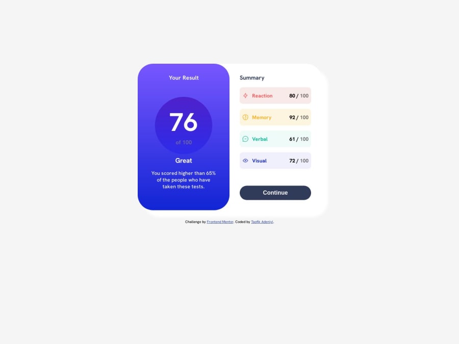
Design comparison
Solution retrospective
Any feedback on best pratices would be appreciated. Feedback on ways to handle the circular result 70 of 100
Community feedback
- @Catalina-HasnasPosted about 1 year ago
Hello! I see that you position your main container using width in percent, height and margin. This can lead to inconsistent results on different screen sizes. A much better way is to automatically place that container to be in the center of the screen. There’s multiple ways to do that. A simple one to understand is to have the container be a flex item inside a flex container with: { display: flex; align-items: center; justify-content: center; }
Then, you can play around with the width of the container, by using media queries or clamp(). You can find other ways if you google: “how to center a div” :D.
I see that you use media query to make it responsive, which is all right. But you can use grid or css to make it responsive without media queries! It will add the benefit of looking nice in between the breakpoints. Look into unsing auto-fit/auto-fill of grid (I mostly get my Grid info from here ) or flex-wrap propery.
Marked as helpful1@taofik-adeniyiPosted about 1 year ago@Catalina-Hasnas, do appreciate your feedback would work on the changes suggested. Thanks
1
Please log in to post a comment
Log in with GitHubJoin our Discord community
Join thousands of Frontend Mentor community members taking the challenges, sharing resources, helping each other, and chatting about all things front-end!
Join our Discord
