

Design comparison

Solution retrospective
With the help of a generous comment I was able to undertsnad what to do.Hope this solution is good.Learn quite a bit about max-width,setting image display as block,height auto,when to use media queries and a lot of things
What challenges did you encounter, and how did you overcome them?I was facing the challenge of my image getting out of the container.Although I was able to solve it..it took a lot of time...I understood that I have to set max-width and height as auto Also with the help of another solution I was able to figure out what color of fonts is needed as well as line height that will give the closest look. I am still unable to find the font family though
Community feedback
- P@Islandstone89Posted 3 months ago
HTML:
-
Every webpage needs a
<main>that wraps all of the content, except for<header>andfooter>. This is vital for accessibility, as it helps screen readers identify a page's "main" content. Wrap the card in a<main>. -
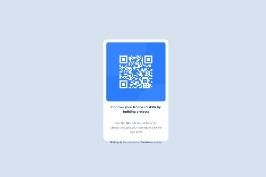
The image has meaning, so it must have proper alt text. Write something short and descriptive, without including words like "image" or "photo". Screen readers start announcing images with "image", so an alt text of "image of qr code" would be read like this: "image, image of qr code". The alt text must also say where it leads(the frontendmentor website). A good alt text would be "QR code leading to the Frontend Mentor website."
-
It's recommended to give elements a class instead of an
id. This article explains when to use anidattribute. -
You don't need to wrap the image or the text in a
<section>or a<div>, so I would remove those. Your HTML should look like this:
<main>
  <div class="container">
    <img>
    <h2>
    <p>
  </div>
</main>
CSS:
-
Including a CSS Reset at the top is good practice.
-
I recommend adding a bit of
padding, for example16px, on thebody, to ensure the card doesn't touch the edges on small screens. -
Use the style guide to find the correct
font-family, and remember to specify a fallback font:font-family: 'Outfit',sans-serif; -
On the
body, changeheighttomin-height: 100svh- this way, the content will not get cut off if it grows beneath the viewport. Remove thewidth- thebodyis a block element, meaning it takes up the full width automatically. -
Remove all widths and heights in
%andvw. -
Add a
max-widthof around20remon the card, to prevent it from getting too wide on larger screens. -
font-sizeshould be set in rem. -
Since all of the text should be centered, you only need to set
text-align: centeron the body, and remove it elsewhere. The children will inherit the value. -
To create the space between the image and the edge of the card, set
paddingon all 4 sides of the card:padding: 16px;. -
On the image, add
display: block,height: autoandmax-width: 100%- the max-width prevents it from overflowing its container. Without this, an image would overflow if its intrinsic size is wider than the container.max-width: 100%makes the image shrink to fit inside its container. -
As the design doesn't change, there is no need for any media queries. When you do need them, they should be in
remorem, notpx. Also, it is common practice to do mobile styles first and use media queries for larger screens.
Marked as helpful0 -


Please log in to post a comment
Log in with GitHub
Join our Discord community
Join thousands of Frontend Mentor community members taking the challenges, sharing resources, helping each other, and chatting about all things front-end!
Join our Discord