Basics of CSS and HTML and first time Media Queries.

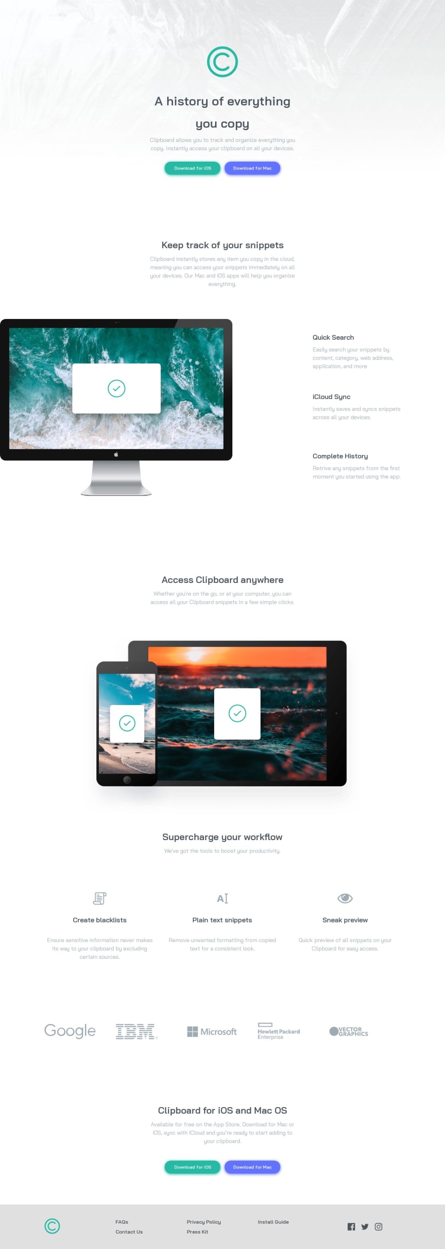
Design comparison

Solution retrospective
I did this in an effort to stay on top of my HTML and CSS while I start learning JavaScript. I want to keep doing these once a week.
A few issues with this one:
-
When doing the mobile view, I wasn't able to center the buttons properly, they are ever so slightly misaligned from one another. I tried many fixes but couldn't attempt it.
-
I could not figure out how to make the "computer" image center itself while the screen size shrinks. I was able to do it for the "devices" photo but not this one.
-
Class names. I need to start using better class names to make it easier to understand where things are and what element they are for. It became a big hassle when doing the media queries.
This was my first time using media queries so I hope I did an okay job with them.
Feel free to offer advice and help me out with the issues I had. This was so fun!
Community feedback
Please log in to post a comment
Log in with GitHub
Join our Discord community
Join thousands of Frontend Mentor community members taking the challenges, sharing resources, helping each other, and chatting about all things front-end!
Join our Discord