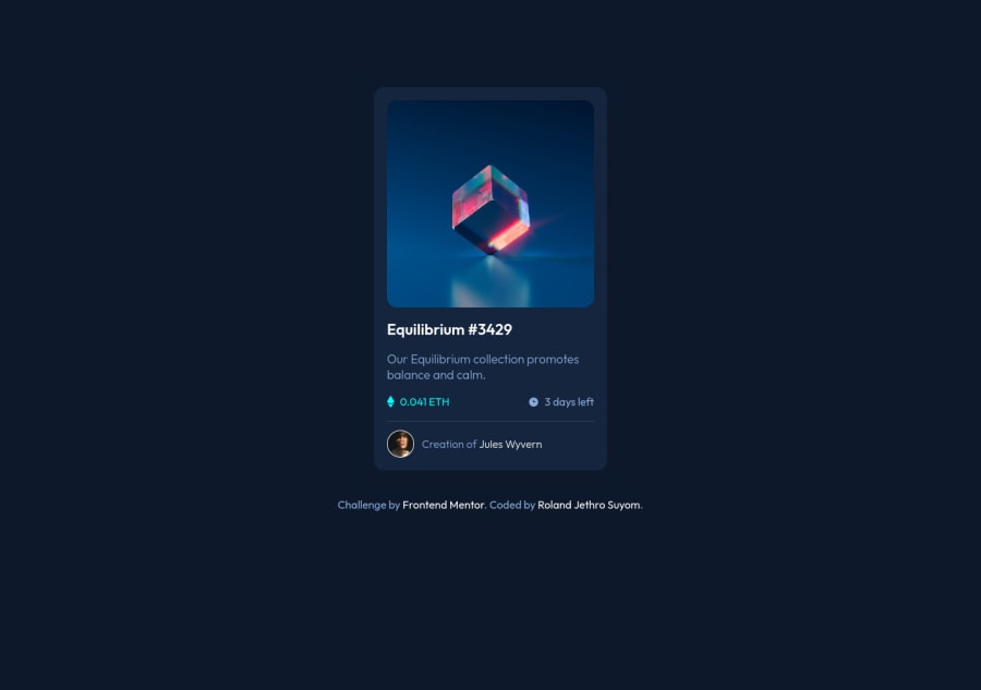
Used BEM on my CSS naming convention and applied Image overlay Icon.
Design comparison
Solution retrospective
Kindly check my solution especially my html element composition. I am not that confident the way how I construct my elements. Thanks.
Community feedback
- @pikapikamartPosted almost 3 years ago
Hey, really nice work on this one. The overall layout looks great I think, it just has this outer
background-colorand in the design it doesn't have that.David Turner already gave feedback on this one, just going to add some suggestions as well:
- Remove the
overflow: hiddenon thebodytag. Doing this will just prevent a user from scrolling on the site, imagine that there are lots of content in here, applying this will prevent them scrolling on those. Only use it on a specific component that needs to hide its overflowed content. - Always have a
mainelement to wrap the main content of the site. For this usemaintag on the.containerselector. - On this one, since the image is being treated as an interactive component since there is a
:hoverstate, then make sure that there is an interactive element used in there as well or wrapping the image. It could either bebuttonoratag and use depending on what you think will happen if clicking the image. If clicking the image pop-up something that the user can see the full nft, then go withbuttonbut if clicking it redirects user in another page to see the full nft, then go withatag. - Also, for an
atag to work properly, always include thehrefattribute. - For now, you can use
h1on the nft name but have a look about sr-onlyh1tag. - Those eth-icon and the clock-icon right now are only acting as decorative images. Decorative images should be hidden for screen-reader at all times by using
alt=""andaria-hidden="true"to theimgtag or onlyaria-hidden="true"if you are usingsvginstead ofimgtag. Although the eth-icon could be using analtI would still remove it since like I said, on a real site there would be bunch of nft and we don't want the user to traverse each eth-iconimg. - When wrapping up a text-content, make sure that it is inside a meaningful element like
ptag or heading tag and not using likediv, spanto wrap the text. - Person's image could use their name as the
altvalue since it is already present and it makes sense to do so since they are being featured as the creator of the nft. - When using
imgtag, you don't need to add words that relates to "graphic" such as "image" and others, sinceimgis already an image so no need to describe it as one.
Aside from those, great job again on this one.
Marked as helpful2@Jeth0214Posted almost 3 years ago@pikapikamart , hello sir Raymart. Thanks for the tips. Good pointers to look on. I will apply it all . Salamat sir.
1@Jeth0214Posted almost 3 years ago@pikapikamart , Sir, I tried to followyour tips. Please kindly check if I was do it correctly. Thanks.
0@pikapikamartPosted almost 3 years ago@Jeth0214 Hey, glad that you implemented those suggestions above!!
Unti lang nakikita ko pilipino dito, pero english pa din tayo para lahat included.
Just saw the site and looks great as before. Before looking the markup again, I zoomed out and noticed that the layout is not centered. Don't know why I didn't noticed before. But you could add:
display: grid;
justify-items: center;
place-content: center;
On the
bodytag. But again, I noticed that the card is not centered and thinks that thewidth: min()..could just be replaced bymax-width: 400px( convert it to rem ) so that it will be clearer since the layout doesn't really need to change it's size.- For the nft image or in
imgtag in general, if you set anaria-hidden="true"then make sure that theimgis usingalt=""since you want the image to be hidden for screen reader user. If you wan them to be seen, use analtvalue. - For the
atag, on this, theatag should be wrapping the nft image and not the preview-icon since the preview-icon is supposed to be hidden since it is only a decorative image. Usealt=""andaria-hidden="true"on the preview-icon. Wrap the nft-image with thisatag. - Same for the eth-icon and clock-icon, remove the
altvalues. - For the person, like I said before it could use the person's name since it is a meaningful image on the site. Therefore remove the
aria-hidden="true"on it.
I think those only should be changed at the moment.
1@Jeth0214Posted almost 3 years ago@pikapikamart hello sir , I tried to remove the alt on the image with icon. I got HTML validation errors .
0@Jeth0214Posted almost 3 years ago@pikapikamart , Auh I see sir, I just need to put an alt with an empty values , correct sir?
0@pikapikamartPosted almost 3 years ago@Jeth0214 Yes, use an empty string
alt="'with it. Animgtag without analtwill cause an error because screen-reader will instead announce that the src is missing when traversing animgtag.0@Jeth0214Posted almost 3 years ago@pikapikamart display: grid works like a magic. Thanks sir
0@Jeth0214Posted almost 3 years ago@pikapikamart sir, I adjusted again my solution. Thanks for the tips. Maapply ko to sa next challenge ko.
1 - Remove the
- @brodiewebdtPosted almost 3 years ago
This looks very good. Spacing and alignment look good. Hover effect are working. Great job.
Wrap your container div in a Main tag and change the H3 to an H1 and it will clear the accessibility warnings.
Download AXE DevTools and you can clear accessibility warnings while you code. https://www.deque.com/axe/devtools/
Hope this helps.
Marked as helpful0@anoshaahmedPosted almost 3 years ago@brodiewebdt Thanks for the AXE DevTool resource
0@Jeth0214Posted almost 3 years ago@brodiewebdt , Thanks for the tips. It was very helpful. I will take a look of it.
0@Jeth0214Posted almost 3 years ago@brodiewebdt I already tried the AXE Dev tools and it was very helpful. Thanks once again
0
Please log in to post a comment
Log in with GitHubJoin our Discord community
Join thousands of Frontend Mentor community members taking the challenges, sharing resources, helping each other, and chatting about all things front-end!
Join our Discord
