Design comparison
SolutionDesign
Community feedback
- @ricardozuPosted over 2 years ago
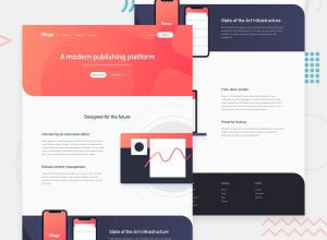
Be carefull with colors and palettes, if it doesn't contrast well you'll going to have some issues with accesibility.
Check it out on navegation nav, the gray color it's dificult to see it.
1
Please log in to post a comment
Log in with GitHubJoin our Discord community
Join thousands of Frontend Mentor community members taking the challenges, sharing resources, helping each other, and chatting about all things front-end!
Join our Discord
