Design comparison
SolutionDesign
Solution retrospective
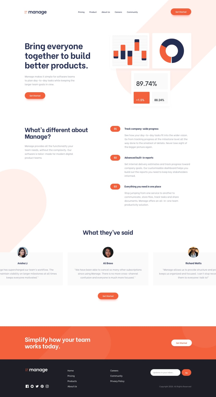
What did you find difficult while building the project? -> what i find difficult is adding svg pils image in background, because it was overlapping over two section, so i have put image(svg) as content of ::befor psedo element
Community feedback
- @Caleb-AbuulPosted 11 months ago
You did an awesome job. You only have a few hover errors on texts here and there, like the
navlinks should turn gray when hovering. And also the border of theinputtext-box should be that primary orange color when in active.0
Please log in to post a comment
Log in with GitHubJoin our Discord community
Join thousands of Frontend Mentor community members taking the challenges, sharing resources, helping each other, and chatting about all things front-end!
Join our Discord
