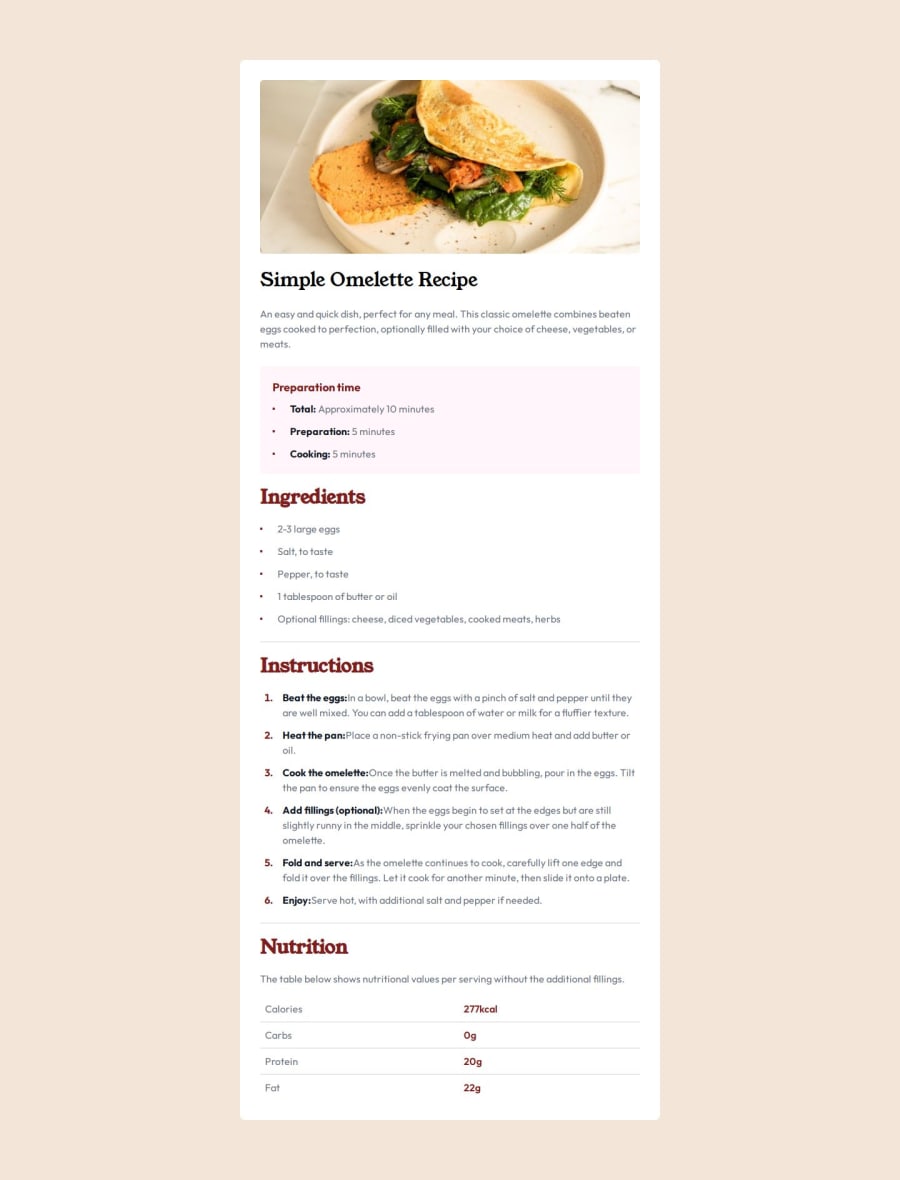
use tailwindcss to implement recipe page
Design comparison
Solution retrospective
I originally intended to use Sass for this project, as I had completed several simpler projects with it before. However, when working on this particular project with Sass, I found it challenging to proceed:
- There were significantly more variations in spacing, font sizes, and colors compared to previous projects, and no free Figma design was provided.
- I needed to estimate these values based on rough visuals from images, which took up a considerable amount of time—more than actually writing CSS. This led to less-than-ideal results, with discrepancies between the final output and the design mockups, as well as inconsistent styling.
Considering this was a relatively straightforward project, I questioned how I would tackle more complex challenges on platforms like Frontend Mentor.
Consequently, I decided to abandon using Sass and instead opted for TailwindCSS, which provides a comprehensive design system. With TailwindCSS, there's no need to struggle with exact pixel values; we can simply choose from its pre-defined set of spacings that closely match our designs.
The process involved first writing the HTML and then incrementally applying utility classes until achieving a resemblance to the design mockup. It felt akin to playing a game and clearing levels, with the unique twist being that we create the level ourselves (by writing the HTML). The objective was to make our HTML resemble the design as closely as possible.
This is my first time completing a project using TailwindCSS, and it fills me with a sense of pride.
What challenges did you encounter, and how did you overcome them?In lists, how can we ensure that the marker is vertically centered within the text of a list item, even when the text wraps?
One solution I've come up with is to forego the native marker and instead create a custom marker using a pseudo-element. We apply a flex layout to the li element and set align-items: center. This way, our custom marker remains vertically centered even when the text wraps.
Here are the specific implementation details:
What specific areas of your project would you like help with?This was my first project using TailwindCSS, and my understanding of it is still rather superficial. I wonder if I have been using it correctly and avoiding common pitfalls. Additionally, I am uncertain if there are areas where my code could be simplified or made more concise.
Furthermore, I am not very confident about the HTML I have written; I am unsure whether I have used the appropriate tags and whether the nested structure is reasonable.
Community feedback
Please log in to post a comment
Log in with GitHubJoin our Discord community
Join thousands of Frontend Mentor community members taking the challenges, sharing resources, helping each other, and chatting about all things front-end!
Join our Discord
