Submitted 11 months ago
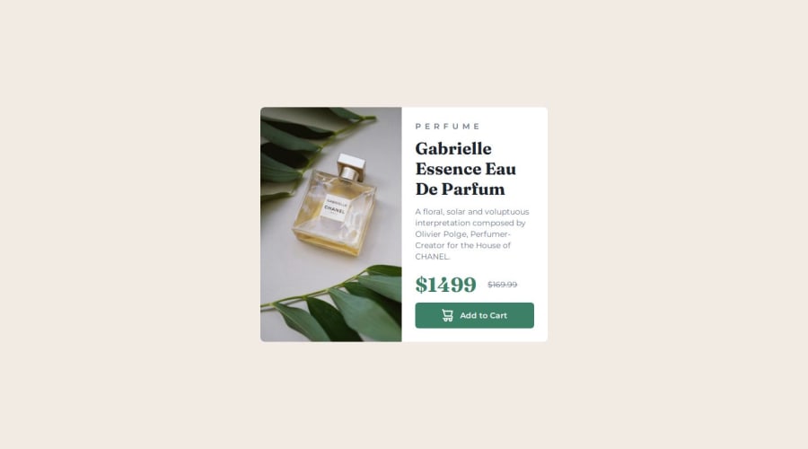
use tailwindcss to implement product-preview-card
#tailwind-css

@perterHUAN

Design comparison
SolutionDesign

Solution retrospective
What are you most proud of, and what would you do differently next time?
empty
What challenges did you encounter, and how did you overcome them?How to make images responsive?
- Employ the `` element to serve different-sized photos depending on screen size.
- Use
object-fit: coverto maintain the inherent aspect ratio of the image without distorting it through stretching; however, this may cause cropping of the photo. - Set
max-width: 100%to prevent images from overflowing their containers. - Utilize
height: autoorblock-size: auto(for CSS Grid layouts) to preserve the natural proportions of the image while resizing.
references:
What specific areas of your project would you like help with?On non-small screens, how should the width sizes of both left and right sides (which should be equal) be determined?
The overall width of the card component has a limit of sm:max-w-lg.
For setting the widths of the two sides: Should a specific width be directly assigned, like so:
flex-basis-[33ch]
Or, Should a percentage be set, where the width at this point would depend on the size of the left-side photo and the maximum content width on the right side, along with the Max-width of the parent element:
flex-basis-2/4
Community feedback
Please log in to post a comment
Log in with GitHub
Join our Discord community
Join thousands of Frontend Mentor community members taking the challenges, sharing resources, helping each other, and chatting about all things front-end!
Join our Discord