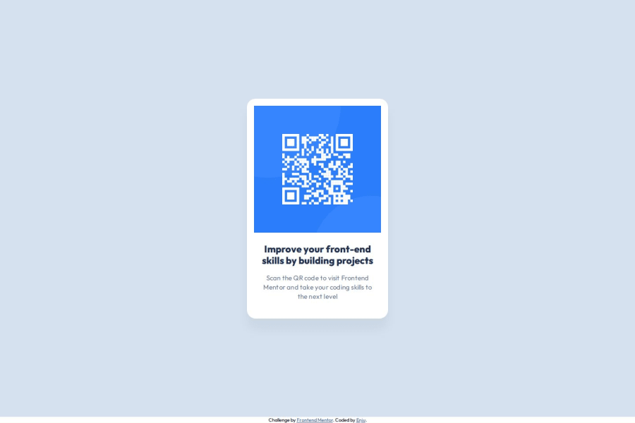


Design comparison

Solution retrospective
For this practice project, I divided the page into two sections: qr-code-container and attribute (which explains who created the project). Then, in the parent element, main, I applied Flexbox. I gave the main section, qr-code-container, flex-grow: 1 so that it takes up the remaining space, which means I don't need to manually set the height anymore.
What challenges did you encounter, and how did you overcome them?main { display: flex; flex-direction: column; width: 100vw; height: 100vh; } .qr-code-container { flex-grow: 1; background-color: #d5e1ef; display: flex; justify-content: center; align-items: center; }
The tricky part was keeping track of the padding and how it affects the container width. With Figma, we can clearly see the spacing between the sections. At first, I just included the total width, not realizing that it didn’t account for the padding.
I've been trying to understand the difference between HSL and RGB in CSS. From what I found online, it seems like HSL produces better-looking colors. However, when I implemented the colors from a Figma design into a website, I noticed that the colors in HSL looked a bit washed out and weren't as vibrant as in the design. On the other hand, using RGB seemed to give a color that was much closer to what was in the design, and it looked more accurate.
Community feedback
Please log in to post a comment
Log in with GitHub
Join our Discord community
Join thousands of Frontend Mentor community members taking the challenges, sharing resources, helping each other, and chatting about all things front-end!
Join our Discord