Design comparison
Community feedback
- @LonlysoftPosted 17 days ago
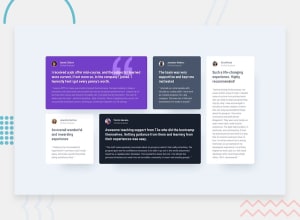
Well organized code and truthfully responsive. Great work! The only thing that is a little mistaken from the approach is the padding of the body and the color of the
user-desctext. Besides the description having a bigger size than general text, there's not as much contrast as in the white background cards. So the.user-descthat aren'tbackground-color: white;should becolor: --white;0 - @AtaizePosted about 1 month ago
Congratulations, your code is well organized. I also liked the names you gave the classes, I thought they were very descriptive. Congratulations!
0 - @CoolNight99Posted about 1 month ago
The grid item sizes are a bit inaccurate but it looks good otherwise.
0
Please log in to post a comment
Log in with GitHubJoin our Discord community
Join thousands of Frontend Mentor community members taking the challenges, sharing resources, helping each other, and chatting about all things front-end!
Join our Discord
