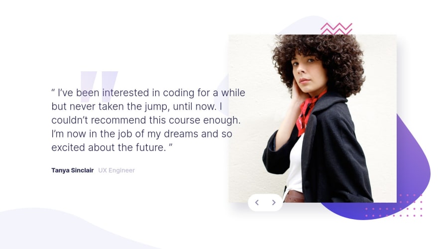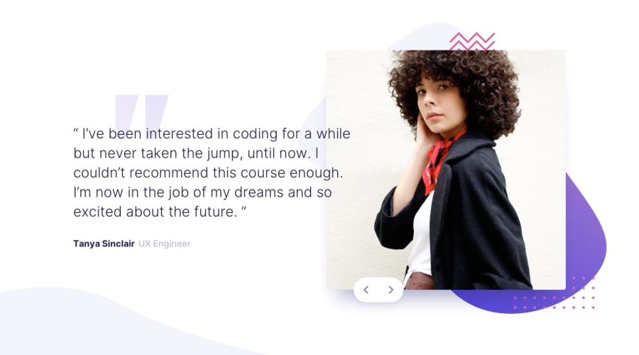
use of pure HTML, CSS and javascript and test of GSAP
Design comparison
Solution retrospective
Hi 🙂,
on this project, I mainly wanted to test GSAP. I am open to any comments or suggestions!
Community feedback
- @ApplePieGiraffePosted almost 4 years ago
Greetings, Elise Rousseau! 👋
Amazing job on this challenge! 👏 The animations you added are very cool! 🤩
I suggest making the entire buttons clickable (not just the icons inside them) so that the slider is easier to control. Also, you might want to consider leaving the desktop layout present for a little long (or maybe just moving some things around slightly) so that there isn't so much empty space to the sides of the design when the layout first changes from desktop to mobile. 😉
As always, keep coding (and happy coding, too)! 😁
1@SarahHenriettePosted almost 4 years agoHi to you @ApplePieGiraffe 👋,
Thank you very much, I had a lot of fun working on these animations 🙂
Thank you for your very helpful suggestions 👍
0 - @AgataLiberskaPosted almost 4 years ago
OMG I love the animations, adding GSAP to my never-ending list of things to check out :D
Just one note - on smaller screens (tablet size), the design is all the way to the left, think it would look better with margin: auto :)
1@SarahHenriettePosted almost 4 years ago@AgataLiberska
Thank you very much for your comment 🙂 . It's true that it's not easy to find the time to do everything! good luck anyway
I was not paying attention, thank you very much :)
0 - @AlexanderMeloxPosted almost 4 years ago
Looks good, just think the Name is a blueish color on the design, and on yours is a black
1@SarahHenriettePosted almost 4 years ago@AlexanderMelox it's true thank you for your comment 👍
1
Please log in to post a comment
Log in with GitHubJoin our Discord community
Join thousands of Frontend Mentor community members taking the challenges, sharing resources, helping each other, and chatting about all things front-end!
Join our Discord
