Submitted over 1 year ago
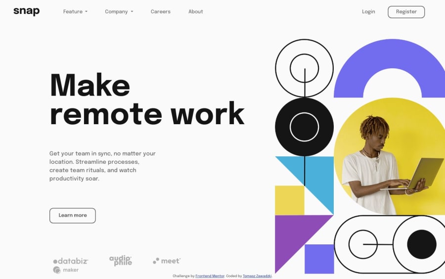
Use of bootstrap technology. intro-section-with-dropdown-navigation
@ExpertoMontanero
Design comparison
SolutionDesign
Solution retrospective
I struggled with the "feature" section dropdown, combining icons and text to be well organised as in the original design. I think I haven't done it in optimal way. Can you give me soulution how to make it more clearly or sth? Thx in advance. PS(No mobile design included) :<
Community feedback
Please log in to post a comment
Log in with GitHubJoin our Discord community
Join thousands of Frontend Mentor community members taking the challenges, sharing resources, helping each other, and chatting about all things front-end!
Join our Discord
