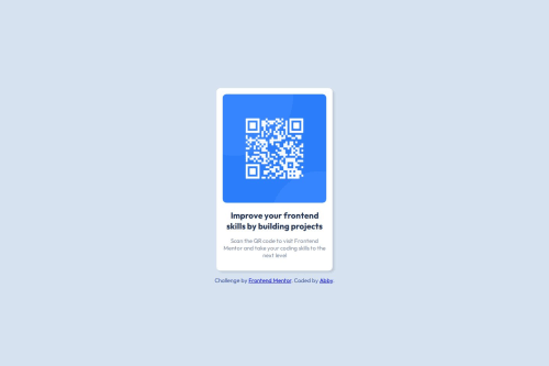
Design comparison
Solution retrospective
To make a beautiful page. It's my first try.
What challenges did you encounter, and how did you overcome them?there are too many difficulties I've met... thanks to search engine
Community feedback
- @alittlebrokenPosted 3 months ago
Very good job, matches up very nicely.
I would replace your <div class="card"> ... </div> with a semantic tag like <main class="card"> ... </main> to pass the landmark tests and help screen readers process the page.
Marked as helpful1 - @TedJenklerPosted 3 months ago
Hi @Abby-Liu,
Nice project! To improve it, here are a few suggestions:
I would recommend using the <main> tag to make the structure more semantic, which will also improve SEO and accessibility (like the first feedback mentioned*)
While you should have a maximum of one h1, it’s important to use h2, h3, and so on in descending order of importance. Since h1 is typically used for the page header, in this case, the first heading should actually be an h2.
Because of the shareability of this project, you should add meta OG (Open Graph) tags to create beautiful link previews and improve SEO.
Consider making the QR codes clickable, which can help older people by allowing them to use it as a link instead of scanning it.
As an extra challenge, I would suggest learning how to create custom QR codes—it’s a really fun topic!
Keep up the good work!
Best, Teodor
0
Please log in to post a comment
Log in with GitHubJoin our Discord community
Join thousands of Frontend Mentor community members taking the challenges, sharing resources, helping each other, and chatting about all things front-end!
Join our Discord