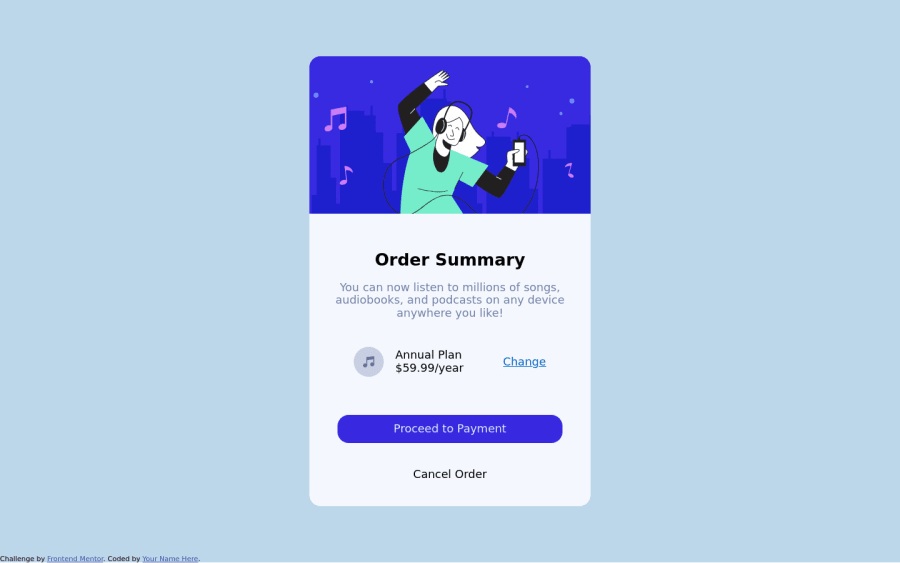
Use Html and pure Css clearly handling the bem methodology :)
Design comparison
Solution retrospective
What can I improve on the receptive design friends?
Community feedback
- @pikapikamartPosted about 3 years ago
Hey, great work on this. Layout seems fine but you are missing the background image, the wave image one. Perhaps you forgot to add it?
Some suggestions would be:
- If you inspect your website in dev tools at the bottom, you can see that your layout is being squished. This is caused by the
height: 100vh
on yourmain
tag. If you set an element to haveheight: 100vh
it might look fine to your monitor/screen, but if you scale down your browser's height, you can see the distortions. This is because usingheight: 100vh
only occupies the current viewport's height. Removing this will be really good or you can set amax-height: 100vh
instead ofheight: 100vh
. Also on yourbody
tag, do not set thefont-size: 2vh
, do not use scaling units on font-sizes unless you are using aclamp
function. Userem
units - Good choice on using
article
! - your page lacks
h1
element, you can use theh1
to wrap theorder summary
text instead of usingh2
on it. - Your
proceed to payment
andcancel order
html element is not suited. You useddiv
which is not accessible at all. You can use eithera
tag orbutton
on those two elements. If you think that the functionality links you up in another page, usea
tag. If you think that clicking those element pops up a modal or some sort, usebutton
. - Also you don't have to
position: absolute
the attribution.
Aside from those, good job.
Marked as helpful1 - If you inspect your website in dev tools at the bottom, you can see that your layout is being squished. This is caused by the
- @sergiopin22Posted about 3 years ago
Hey really, thank you very much, what a good feedback you have given me, I really appreciate you, I hope to continue practicing I am from Colombia and I have to translate your opinion lol
Greetings what a good level I see that you drive :)
0 - @frontendnusPosted about 3 years ago
I only have a little bit feedback. I think you overuse flexbox there where we can still do without flexbox. But your project looks good for me
0
Please log in to post a comment
Log in with GitHubJoin our Discord community
Join thousands of Frontend Mentor community members taking the challenges, sharing resources, helping each other, and chatting about all things front-end!
Join our Discord