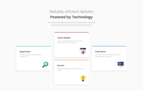
Submitted over 1 year agoA solution to the Four card feature section challenge
Use Grid for box wrapper and flex for all to complete

@duongns-vn
Solution retrospective
What are you most proud of, and what would you do differently next time?
I was hesitant to choose between Flexbox and Grid to responsive for 4 cards. In the end I decided to choose Grid with grid-templete-areas property, because I thought maybe it would help more and faster than flexbox in this case.
Code
Loading...
Please log in to post a comment
Log in with GitHubCommunity feedback
No feedback yet. Be the first to give feedback on duongns-vn's solution.
Join our Discord community
Join thousands of Frontend Mentor community members taking the challenges, sharing resources, helping each other, and chatting about all things front-end!
Join our Discord