Not Found
Not Found
Not Found
Not Found
Not Found
Not Found
Not Found
Not Found
Not Found
Not Found
Not Found
Not Found
Not Found
Not Found
Not Found
Not Found
Not Found
Not Found
Not Found
Not Found

Submitted

Use css tools.How to mach colors modify container.

@ElianaRestrepo99

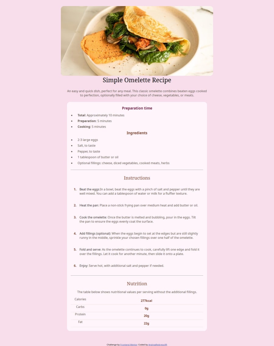
Desktop design screenshot for the Recipe page coding challenge

This is a solution for...

  • HTML
  • CSS
1newbie
View challenge

Design comparison


SolutionDesign

Solution retrospective


What are you most proud of, and what would you do differently next time?

I feel happy to be able to give it life and replicate what I have seen, learning more every day. Next time I would pay more attention to focusing on CSS

What challenges did you encounter, and how did you overcome them?

One of the challenges was the colors that the challenge contained when calling them from my css was not by color--, the way I managed to configure them was by calling the class by hsl and configuring the css from the beginning with the url.

What specific areas of your project would you like help with?

I would like to know more about images, containers, how to add backgrounds and colors from other platforms to CSS.

Community feedback

@R3ygoski

Posted

Hello Eliana, congratulations on completing the project, it turned out quite interesting.

I had a question: did you intentionally place the image outside the card? If so, it adds an intriguing touch.

Since I'm not sure if it was intentional or not, I'll focus on giving HTML-related tips. I noticed your HTML is well-structured, but it lacks semantic markup, which is crucial for making your project more accessible and for SEO purposes. I'll suggest replacing some <div> elements with semantic tags for you to consider:

  • <div class="container"> could be replaced with a <main> tag, as it contains the main content of the page.
  • <div class="recipe-img"> could be replaced with a <figure> tag, as its content is just an image, and that image is the main focus.
  • <div class="recipe-step"> could be replaced with a <section> tag, as all the content within it is thematically related and dependent on the main content.

Regarding the instructions section, you've created a somewhat verbose structure that could be simplified using an <ol> and <li>, which would reduce the need for so many <div> elements. You could then style the numbers using the ::marker pseudo-element.

Here's a link about ::marker: W3School - Marker.

Once again, congratulations on the project and your creativity. I genuinely appreciate the deviation from the standard approach. Keep practicing and improving. If you have any questions, please ask below, and I'll do my best to help.

1

@ElianaRestrepo99

Posted

@R3ygoski Thank you very much for your advice, and for wanting to continue guiding me in my learning process. I did feel that I should improve some things and with this guide I already know which points I should practice more, in response to the question I did not put the image outside the card intentionally, but seeing that it gave a unique touch to the project. I decided to leave it there. . since I love giving a unique touch to each project I do.

1

Please log in to post a comment

Log in with GitHub
Discord logo

Join our Discord community

Join thousands of Frontend Mentor community members taking the challenges, sharing resources, helping each other, and chatting about all things front-end!

Join our Discord