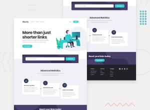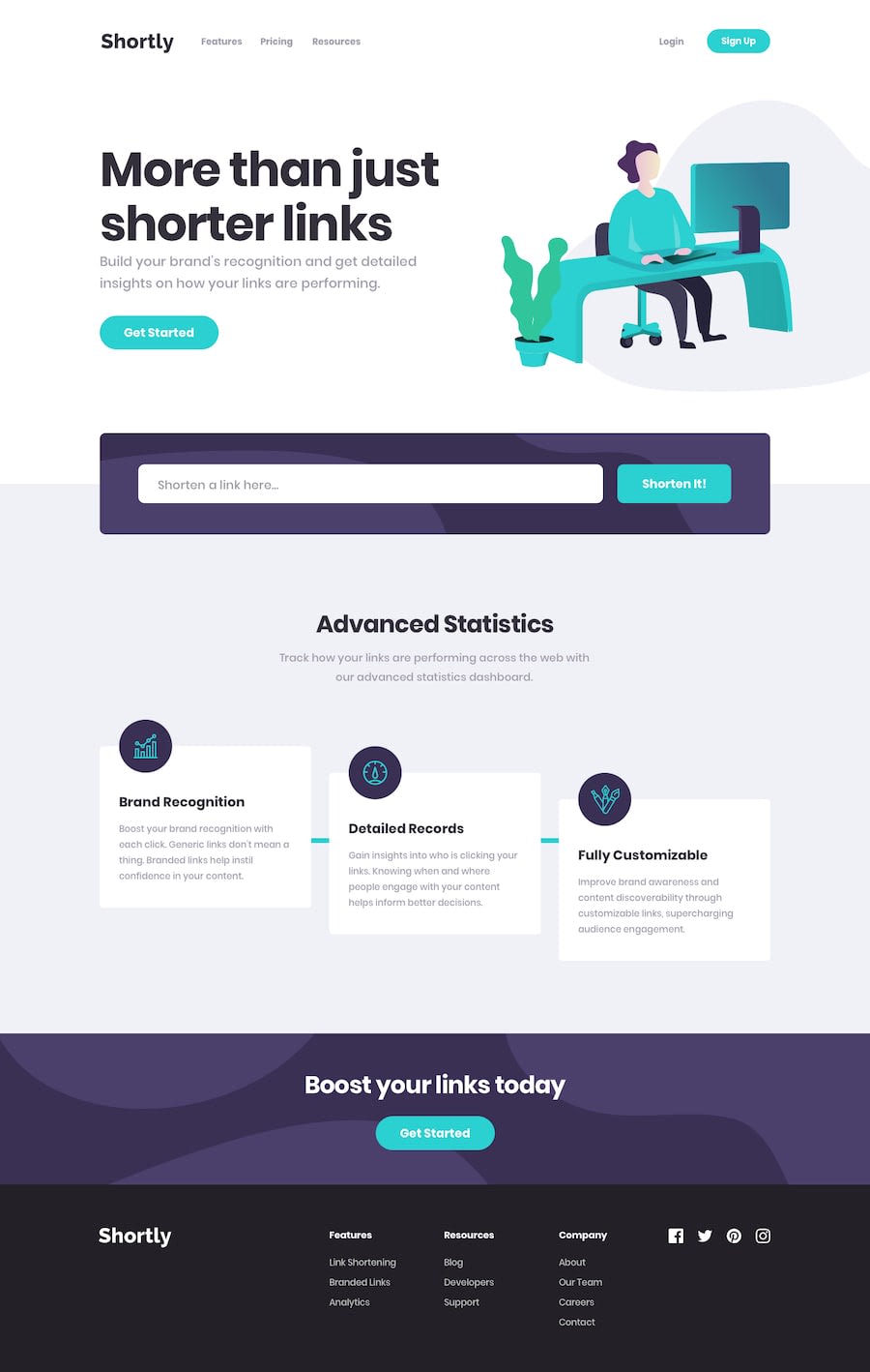
Design comparison
Solution retrospective
Your feedback is appreciated. I would love to get your insights on what could have been better.
Community feedback
- @AgataLiberskaPosted over 3 years ago
Hi @aman152003! Well done on this challenge! Here are a few things I noticed:
-
on wider screens, there is no bottom padding on the cards, it gets taken up by the text (the card can't expand to fit everything in because of the set height)
-
you removed the outline on your buttons without providing any alternative focus styles, which is not a good practice accessibility-wise
-
your input field is missing a label (an aria-label will be okay)
-
it would be great if you added some hover styles to the social media icons (you can do that by changing the fill color)
Hope this helps, let me know if anything needs more explanation! :)
0@aman152003Posted over 3 years ago@AgataLiberska Thanks for taking the time to point those mistakes out I will try to do better next time and come up with better solutions Once again thanks a lot
0 -
Please log in to post a comment
Log in with GitHubJoin our Discord community
Join thousands of Frontend Mentor community members taking the challenges, sharing resources, helping each other, and chatting about all things front-end!
Join our Discord
