url-shortening-api-master (vanillia css/js)
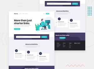
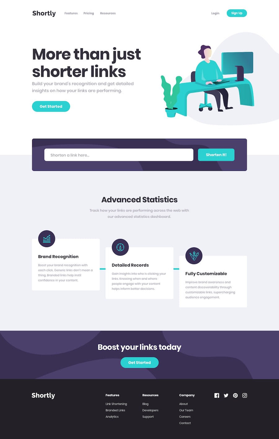
Design comparison
Solution retrospective
🕓≈ 6h Api : search for an other api beacause cleanuri Api doesn't work there is a problem with cors as if you use the no-cors mode it's maybe broken :(
- I used instead url-shortener-service
Community feedback
- @ThabisoMagwazaPosted about 1 year ago
This is very nice solution. I'm impressed that you managed to do it with vanilla html and CSS.
I woud, however, caution against straying from the design when implementing such challenges. It's an interesting test of your attention to detail when you attempt to get the final application to look as close to the design as possible.
These are some of the areas I've identified where you strayed from the design:
- Some button and links hover states are incorrect
- The font sizes and whitespaces are not as per design
- The hero image is quite small compared to the design
Additionally, I'd look into disabling the button when call to the url shortening is in progress. I found myself mistakenly clicking the button twice. It would also help to have some kind of loading indicator.
I'm sure you can find some more. I suggest that you look throught the design again while paying close attention to the whitespace, hover and active stetes.
You have an impressive grasp of CSS and I'm sure you'll benefit from the challenge!
Marked as helpful1@enzo-mirPosted about 1 year ago@ThabisoMagwaza Thanks for your feedback I’ll check all issues but at the moment I don’t get design file of pro Frontend Mentor but I can improve form submition, buttons and links but concerning font-size, image sizing or letter-spacing I must have screen shots that I can’t have in free version, anyway the feedback was helpfull !
Thanks ;)
1@ThabisoMagwazaPosted about 1 year ago@enzo-mir Ah yes I see. It's very difficult to get the sizes and spacing correct if you don't have the figma files
1 - @GioantPosted about 1 year ago
Looks pretty good. Preview is working for me. Nice responsiveness! the only thing I would consider improving is the error handling for the form input.
For example, the first time a user enters your website and wants to shorten a link they see a box.
How come, even when the user does not enter anything (simply just focusing or clicking on the input) to type something.. they are already presented with an error?😅
I understand you want to emphasize to them that they should put a link but the user didn't even start typing yet.
That's what labels and placeholders are for. You already have a placeholder (that is good!)
Instead, It would be better to show the same error when the user enters an input that is not valid (not a valid link). Not before.
Marked as helpful1@enzo-mirPosted about 1 year ago@Gioant I understand what you want to tell for the input error, I’ll fix it, Thanks !
1
Please log in to post a comment
Log in with GitHubJoin our Discord community
Join thousands of Frontend Mentor community members taking the challenges, sharing resources, helping each other, and chatting about all things front-end!
Join our Discord
