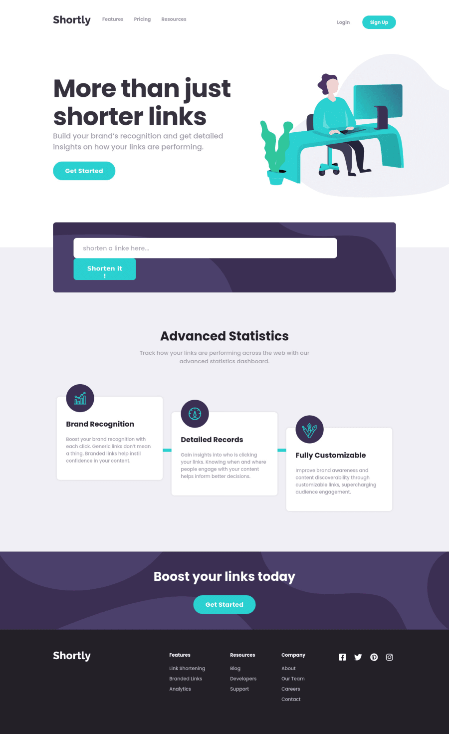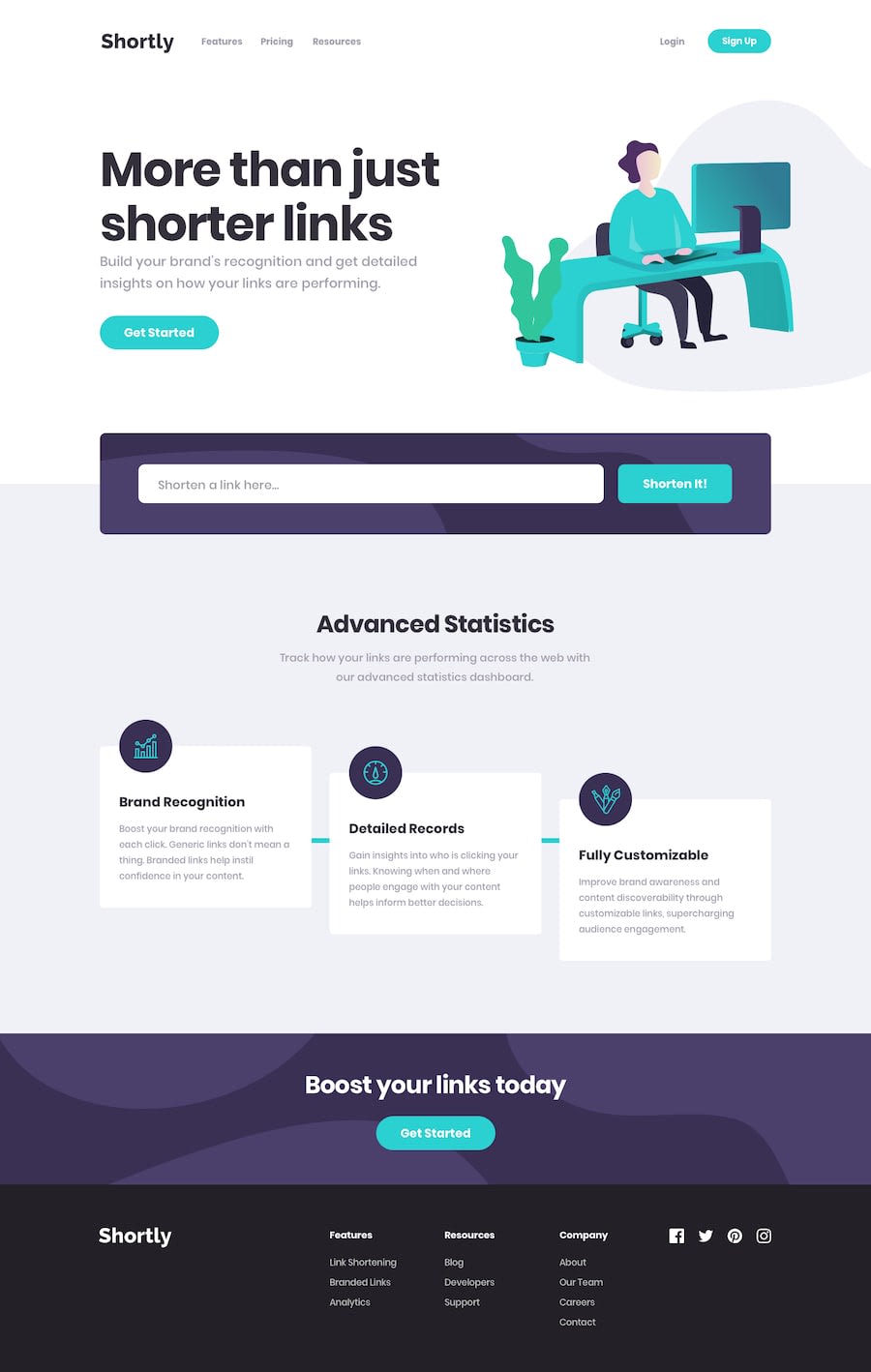
Design comparison
Solution retrospective
This one was interesting?....I guess so.
I struggled alot with this challenge, but eventually I finished it.
I'm not so pleased with the result. There're tons of redundant codes could or should've avoided.
As always, ANY kinds of feedback are all welcomed and appreciated.
Community feedback
- @pikapikamartPosted almost 4 years ago
Hey, just here to say that your solutions is really awesome!
That corner image animation is really clever and those custom hover state in the circles is really good.
The api works well and that shaking while loading, really awesome. Layout resizes good when going in mobile state and this solution is definitely a good good one^^
1
Please log in to post a comment
Log in with GitHubJoin our Discord community
Join thousands of Frontend Mentor community members taking the challenges, sharing resources, helping each other, and chatting about all things front-end!
Join our Discord
